We report on a lot of posters and trailers. These little bits of advertising are crucial in steering fan anticipation for blockbusters or bringing attention to smaller movies. Posters and trailers serve a purpose, and they’re not easy to make. Dozens of posters and trailers are created for movies, and studios carefully select the ones they feel will work the best and have the broadest appeal. Sadly, when it comes to posters, many of the designs are generic. The recent trends are “Back to the Audience”, “Gigantic Tagline”, and “Sparks and Debris”. I’ve chosen ten posters from 2013 that took a chance, broke the mold, and came away with something eye-catching and original.
Hit the jump for my top 10 posters of 2013, and come back tomorrow for the top 10 trailers of 2013.
A few notes before we begin: There are too many posters every year for me to remember, so my great thanks to the good folks at IMP Awards for compiling every poster for the films of 2013. The movie had to have had some kind of release this year to be eligible. Additionally, they couldn’t be Mondo posters because A) they adhere to a different standard than a studio poster; and B) they would win all ten slots. In short, if it’s on this page, it can’t be on my list. Finally, the selection of these posters is based solely on the design of the poster, not on the quality of the film it’s advertising.
10.) Bad Milo!

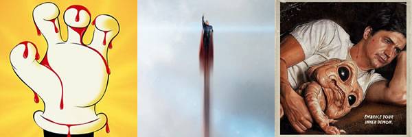
It’s Ken Marino cuddling his character’s anal demon. This odd image is then contrasted with a romanticized portrait as if Marino and the puppet posed like Kate Winslet in Titanic except instead of bare breasts it’s a murderous creature that lives in a guy’s colon. Finally, the tagline is fantastic if you know the plot of the movie.
9.) The Conjuring

Along with Nebraska, the poster for The Conjuring establishes the retro tone of the movie, but I decided to go with James Wan’s critically acclaimed horror movie because it actually takes place in the era it’s evoking. More importantly, the snapshot style image provides a nice reference to how investigators Ed and Lorraine Warren use technology like Polaroids to try and capture the paranormal. If I had one complaint, it’s that this poster and the trailer somewhat spoiled what could have been one of the scariest moments of the year.
8.) Man of Steel

Warner Bros. always releases a slew of posters for their movies, and this one for Man of Steel was their best, not only for this film, but for their entire 2013 slate. I love the simplicity of this poster. It’s not a close-up or even a highlight of the sigil. It’s the universally recognized blue-and-red figure triumphantly soaring into the clouds. Superman is supposed to be a beacon of hope. This is a beacon.
7.) The Heat

This is where I’m starting to cheat. This was a Drafthouse exclusive poster, but since it’s not part of Mondo’s archive, and it’s listed on IMP Awards, I’m including it here. Tom Hodge’s design is rambunctious and fun just like the movie. It’s also a million times better than the regular posters, which were not only bland, but also also used awful photoshopping to make Melissa McCarthy look thinner.
6.) The ABCs of Death

ABCs of Death is from Drafthouse Films, and the Alamo Drafthouse also owns Mondo. I don’t know if Mondo had any input in this poster, but it wouldn’t surprise me. It has the same dark, twisted playfulness of their horror posters, and this one cleverly highlights the juxtaposition of the title. As a side note, If you have kids and are a little disappointed these building blocks don’t exist, these mad scientist building blocks are the next best thing.
5.) The Kings of Summer

Like the poster for The Heat, this poster represents not only the tone of the movie, but also the style of the individual artist. The Kings of Summer had a series of posters, and each one was from a different artist. They’re all good, but Jay Ryan’s poster does the best job of presenting the film’s celebration of adolescent freedom.
4.) Nymphomaniac

Here’s the poster that will haunt your life. You’re welcome.
3.) You’re Next

I circled the Lionsgate booth at Comic-Con hoping to get one of these posters, but to no avail. I love the level of detail right down to some of the victims huddling against a wall or praying to the heavens. Furthermore, the poster cleverly encapsulates both the home invasion plot and the creepy masks of the killers.
2.) Escape from Tomorrow

From its debut at Sundance to its theatrical release, the buzz on Escape from Tomorrow was mostly based on the potential legal battle surrounding the unauthorized filming at Disney World. While this poster still capitalizes on Disney, it does so in a way that emphasizes the insanity of the film rather than inanity of copyright law. I had issues with the movie, but this poster emphasizes what writer-director Randy Moore was going for—a descent into madness at the happiest place on Earth. This poster would also work for Saving Mr. Banks.
1.) The Wolverine

This was the most memorable teaser poster of the year, and 20th Century Fox wisely and confidently decided to expand it into a series of character posters. It’s a savvy move since Hugh Jackman is the only widely recognized actor in the film. Most Americans won’t recognize the supporting cast, so rather than use their faces, the studio decided to take the sumi-e poster design to emphasize the Japanese setting. Fox then took it one step further by taking the title off of these posters, and leaving only the date. It’s an action that says, “These posters are so good, you’re going to want to find out what they’re for.” The posters for The Wolverine weren’t just gorgeous; they were audacious.
2013 Year in Review: