What we’ve got here is your classic “Good News/Bad News” situation. Bad news first: an impressive variety of real-world shenanigans (from geographical shenanigans to technological shenanigans , we saw it all this weekend) conspired to keep the following interview from getting in front of you sooner…but don’t reach for those sleeping pills and dry-cleaning bags just yet, folks: there’s good news, too.
Namely this: while you might’ve had to wait a few extra days for this interview to go live, I’m prepared to wager that you’ll find it to be well worth the wait. It would not be hyperbole to say that the resulting writeup—which you’re about to read-- is one of the most-interesting, most informative interviews I’ve ever had the pleasure of conducting for Collider. See what I mean after the jump, folks.
The secrecy that’s insinuated through every level of the poster industry—from the galleries working on new prints to the collectors who use multiple names to conduct purchases, sales, and trades online—can be frustrating (especially when it’s your job to write about the goings-on in that industry). Galleries and poster boutiques all over the world operate with at least some degree of tight-lippedness (not a word), but some are more concerned with their ability to surprise than others, and that means plugging leaks as often as possible is a big priority.
In the past, some of the biggest leaks have come from artists. Maybe a fan walks up and just starts chatting ‘em up, maybe the artist forgets who he’s talking to (and what’s supposed to remain secret) while giving an interview, maybe an artist drops too obvious a hint. Whatever the case may be, the end result remains the same: galleries have to worry what their artists may or may not reveal while interacting with the citizenry. That worry can manifest in any number of ways, but (from where Limited Paper’s standing) the most common amounts to “do less artist interviews”. Maybe I’m wrong, but that’s how it feels.

From the beginning, we’ve wanted to feature more interviews here at Limited Paper (and if you wished we did, too, make sure you stick around through the last paragraph), in-depth discussions with the artists we cover that tell us a little about what went into the creation of their latest screenprint. And never have we wanted to push for more of that kinda thing than we have in the wake of our interview with Australian artist, Mondo top-shelfer, and Limited Paper “Poster MVP of 2013”, Ken Taylor. Prior to the opening of the Mondo Gallery’s blockbuster Stout & Taylor showcase, I sat down with Taylor to discuss each of the new prints he had for the show, what’s on the horizon, and which of Tyler Stout’s posters he liked best from the show. The resulting interview’s easily the most compelling we’ve ever featured here. Here’s a few random odds and ends before we get into the long-form stuff:
- Taylor told me he’s “working towards” having enough new pieces squirreled away to sustain a solo show at the Mondo Gallery. When? “Hopefully next year”, he told me, adding: “To me, ten pieces makes a show. But I also want to feature more of my original paintings, too.”
- When asked which of Stout’s new prints was his favorite, Taylor couldn’t say enough good things about Attack The Block: “That might be one my favorite things that he’s ever done,” he told me.
- In the course of explaining the posters below, Taylor’s responses actually caused me to change my mind about a few of the pieces. Long before I saw them at the gallery I was looking at them on a laptop, and a few lost something in the translation. Seeing them in-person—and with Taylor’s explanations firmly in mind—gave me a whole new appreciation for at least two of the show’s prints.
On Beetlejuice: “I didn’t really want to do a poster that was just a straight-out picture of Beetlejuice himself; it seemed like a bit of an obvious decision. And besides, the two things I always remembered from the film were the Sandworm and Beetlejuice. Paying tribute to the Sandworm seemed like the right choice, and it also gave me a reason to incorporate the house in there. In the movie, it’s almost a secondary character, y’know? Seemed like it needed to be shown in there. It also gave me the opportunity to play with a more dramatic composition rather than something portrait-based.”
On Metropolis: “Definitely one of my favorites from the show. Probably my favorite, actually. I first saw Metropolis when I was in art school. It was something that (the students) were told to go and have a look at. It’s stood the test of time for almost a hundred years, the set design’s so incredible. I have a real passion for that sort-of art-deco look. It’s something I incorporate into gig posters a lot, and it played to my strengths, design-wise. It was a logical choice for me. It’s weird and complex, and you can get a vibe off it in ways that are translated by design instead of just the story…so, you can almost get away with transferring the film to a poster just by using those elements of design rather than anything more story-based.”

On First Blood: “Y’know, it started with the idea of having the poster feature the chase sequence rather than the typical image, which is Rambo with a big knife or a gun. So, with First Blood, I thought that (Rambo) was carrying so much baggage in the film that I didn’t want to use that image because…well, for one thing, that’s what people would immediately expect. I wanted to see the emotion in his face, so the idea of having the chase sequence behind his head is that—while it is actually happening—there’s a lot of it that does happen in his head, like with these flashbacks to Vietnam. The chase is fueled just as much by his bad memories as it is anything else…I mean, that movie just doesn’t have any happy ending (laughs; I told him I assumed that Stallone probably signed off on the print personally, and asked if he’d responded with any feedback). Well, either he or his people signed off on it, but I did hear Brian Dennehy liked it.”

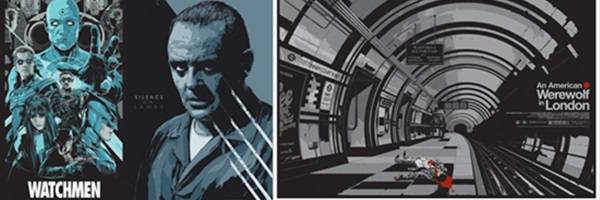
On American Werewolf in London: “Yeah, that’s another one where I didn’t wanna do just another print with the werewolf. I hadn’t watched the film for many, many years, but what did stick out after all that time was the scene in the subway and the scene where he gets attacked on the moors. So, I went with the London Underground scene, and when I rewatched the movie I realized we never saw the aftermath of that scene with the guy on the escalator. I started wondering about what might’ve happened after that, if he’d been flung to another platform or ripped apart entirely or if the tube station had been shut down...”

On Watchmen: “That was probably our most…observed piece from this show, the one where the studio was most involved. There were certain images they definitely wanted us to use, images they didn’t really want us to use…the studio definitely had input with that one, not that that’s a bad thing, or that they were ever unpleasant to work with. It went great, it was just a matter of (figuring out what the studio wanted from the piece).” I asked Taylor if he could name one of the things Warner Bros. didn’t want to see on the poster, but he declined to do so on the record.

On Silence of The Lambs: “Well, actually, that was another one where there was just a list of approved images that we had to use, and (Sir Anthony Hopkins) had several reference images we needed to choose from. The portrait is supposed to be sort-of arresting; I think when people see it on the wall they’ll see what I mean. It was designed that way, with a few other things in mind. First, I remembered that scene where…it’s in one of the other Lecter films--Hannibal, I’m pretty sure-- where they’ve brought him into the nurse at that hospital they have him in, and he just sort of…suddenly whips his head forward and attacks her. Those little lines, the ones radiating out from his body, over on the right? They’re designed to look like switchblades (Ed. Note: I mention that I’d thought the “lines” were meant to resemble the curve of a scalpel, to which Taylor agreed), but they’re also supposed to be, like…action lines, like maybe he’s just suddenly turned his head to stare at you. There’s a ton of detail in that one when you get up close to it.”
And on that front he was absolutely right: if you haven’t seen the Silence of The Lambs poster in-person yet, I’m willing to bet that you’ll feel differently about that one after you see it on a wall. It isn’t my favorite print of this particular Taylor lineup (for Taylor's side, I agree that it’s gotta be his Metropolis …and I’m still kicking myself for not pulling the trigger on that Taylor version when I had the chance). As for the Stouts, I again gotta side with Taylor’s assessment of Stout’s Attack The Block (print), but I’ve also noticed my “favorite” print from the show changes every 24 hours or so. By this time tomorrow I’m gonna be raving about those Labyrinth handbills, just you wait.
Thanks so much to the help and support from Fons PR, Ken Taylor, The Mondo Gallery, Justin Ishmael, Mo Shafeek, Rob Jones, Mitch Putnam, The Non-Artists Formerly Known as Commission Club, and to the entire Limited Paper readership for taking the time to read. Didja guys enjoy this kinda interview? Enjoy hearing about prints and posters from the artists’ perspective? Get vocal about it. I’d love to do more of these, and it probably wouldn’t hurt our chances to do more of these if the Galleries and PR Ninjas of the world were to be made aware of that popularity. Sound off in the comments section below if you want more artist interviews, and—as always-- if you’re an artist or gallery with artwork you’d like to see featured on Limited Paper (or if you’re just some lucky bastard who happened to overhear a bit of poster-related gossip while standing in the bushes outside Martin Ansin’s house) we wanna hear from you! Email Limited Paper directly at LimitedPaper@gmail.com, and be sure that you’re following us on Twitter via @LimitedPaper for ongoing commentary, news updates, giveaways, and more!