
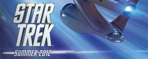
Now before anyone jumps to any conclusions about what this Star Trek sequel image/poster/whatever the hell this thing is, I’m quite sure it isn’t from Paramount or J.J. Abrams Bad Robot. I have a friend who works in (removed for obvious reasons) and this image/poster came across his desk today. If I were a betting man, I’d say the image is for some sort of merchandising item, or for some group that needs to plan very far ahead. But I really don’t know where it originates from. Hell, it could be an image from an upcoming Star Trek calendar.
However, with interest in the Star Trek sequel quite high, I thought it would be smart to share the image. Like most of you, I loved J.J. Abrams Star Trek and cannot wait for this sequel. Hit the jump to check it out.
So what do you think about this image/poster/whatever it is? Wish this was coming out next summer.

It’s not from Abrams, there’s not enough lens flare.
ZING!
Meeesa looooves lense flare! I know, that’s Jar Jar and he’s from Star Wars. But I like him too. So there.
Fake or not, it’s pretty darn cool. I highly doubt that any legitimate promotional material would show the Enterprise from behind, “retreating” from the viewer. Any decent graphic artist would tell you that’s bad design.
As a graphic artist myself, I call bullshit!
Its to Boldly GO, not Boldly COME, unless were talking the porn version.
Yes, I’m sure no legitimate promotional material would do that. . . http://www.iwatchstuff.com/2009/03/30/star-trek-poster-enterprise.jpg
I love that shot of the front of the Enterprise in silhouette.
Oh dang. I just always assumed those were motion streaks, but you’re
right, it’s like, a weirdly placed shadow from behind. Lame.
Well, I USED to love it.
What do you mean? That is a shot of the ship from the FRONT. The circular disc at the bottom of the “neck” clearly shows that.
This just got linked by Simon Pegg. I guess that authenticates it.
Please let the Bussard collectors be orange-ish!!!
I think it’s pretty awesome. Old-school and awesome.
Ugly Enterprise is ugly.
There’s my new wallpaper!!!!!!
Thanks for sharing
OK, sport. Summer 2012 is not NEXT summer, it’s the summer after next.
“Wish this was coming out next summer.”
…
“Wish this was coming out next summer.”
…
you read ‘Wish’. but saw ‘This is”.. ever your eyes checked?
Saucer module is all wrong.
Simon Pegg posted this exact page on his twitter. Authenticity, anyone?
this reminds me of when hurricane Katrina hit, and someone got that NWS image of a supercell floating around
cool story bro
yeah, i forgot to mention though.. the tagline, or title of the picture was: “Hurricane Katrina Coming In”
can’t believe so many people fell for it.
cool story bro
This is ST 1 poster, nt ST 2
Summer 2012 though
They should at least have an official title be4 they release this poster, otherwise it looks like ST1
welcome to :
===== http://tinyurl.com/2cgvcrl ======
This is a shopping paradise
Hi guys, in case you don’t believe this then please have a look at:
http://www.imdb.com/title/tt1408101/
Here you can see they mention Star Trek for 2012 indeed.
Hi guys, in case you don’t believe this then please have a look at:
http://www.imdb.com/title/tt1408101/
Here you can see they mention Star Trek for 2012 indeed.
The fact that ST has a “TM” symbol at the bottom throws red flags in the case of it being a movie poster
Actually, it’s refreshing design.
What an ugly piece of crap cgi. I will take the Andrew Probert model from TMP anyday over this abomination.
Can we move the franchise forward instead of backward? Please? If they intend to continue with this line of prequelish, alternate timeline stuff I’m leaving for greener pastures.
They cant stop doing the alternate timeline stuff now… its pretty much set. This is a new timeline and stuff from the original series/movies will not happen now…
Nice article. I like it.
hmm… I suppose we’ll have to keep ears ad eyes open for this one!
USS Uglyprize. Bleh.
Well it does tell us that we’re stuck with the same crappy, half-baked, way-over-scaled Blenderprise design. Of all the talented artists and designers associated with the Trek franchise, they had to go with Ryan Church’s designed-by-committee flying turd.
Barrier at the galaxy’s edge? Calling Gary Mitchell.
This is what we have but the Original Design Enterprise would have been Best – some of the CGI Done for TOS was Fantastic – just redo the interior touch screen’s etc. would have been Awesome !!!! .
The smartest remark Spock ever said on TV was:
Even in this corner of the galaxy 1+1=2 captain!