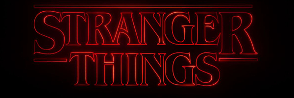
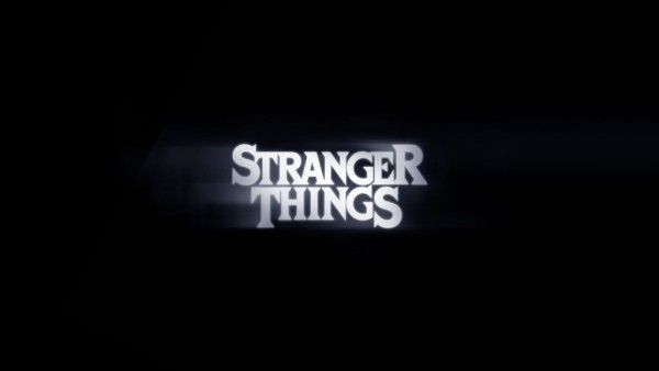
There's no shortage of things to obsess about in Stranger Things—the Winona Ryder renaissance, the addictive soundtrack, the possibilities of what's to come in the (somehow still unconfirmed) Season 2—but perhaps the biggest surprise of Netflix's breakout hit is the massive outpouring of love for the retro font featured in the title sequence.
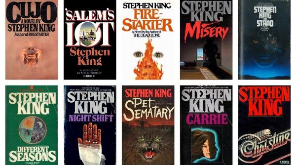
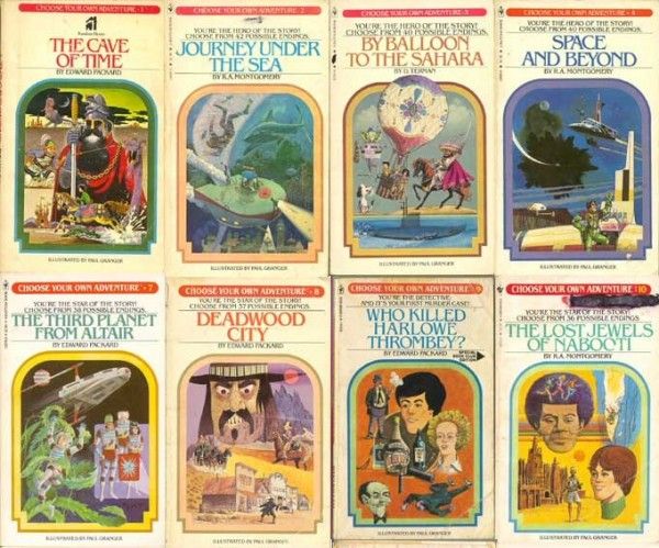
Or maybe it's not such a surprise when you consider that font, called ITC Benguiat, is a hallmark of the era Stranger Things so dotingly pays reverence to. It graced the cover of countless Stephen King novels, The Smiths used it on the cover of their album 'Strangeways', and it was the title font for those 'Choose Your Own Adventure' books you probably loved as a kid.
Obviously, that's no accident, as the entire Stranger Things aesthetic is deeply rooted in the pulpy genre of the 80s, and creators Matt and Ross Duffer put a lot of thought into their title sequence font, which they described to THR as "super important." To create the opening titles, The Duffer Brothers collaborated with the company Imaginary Forces (the very same behind Mad Men's iconic title sequence) sending them about 15 different book covers, most, but not all, Stephen King paperbacks. Ultimately, they landed on ITC Benguiat, the glowing red typeface we've all come to love that so immediately evokes the nostalgia the series was gunning for.
But the folks at Imaginary Forces weren't content to slap a static logo on the screen and call it a day, instead giving the title sequence movement and framing that slowly reveals the ITC Benguiat title all its glory. Imaginary Forces' Creative Director Michelle Dougherty, who oversaw the project, explained to Wired that they kept the title sequence simple to focus on that reveal. “We could concentrate on the type—the counter of the A and the serifs," She said. "We had to find the most beautiful combinations.”
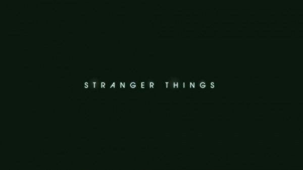
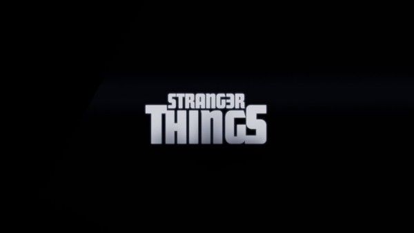
As it happened, ITC Benguiat was named after its creator Ed Benguiat, a giant of the type industry who has created more than 600 fonts during his career, many of which you probably see and/or use every day. Benguiat created the logos for Ford, The New York Times, Playboy, Esquire, Sports Illustrated, and Estee Lauder among many, many others. And the legendary 88-year old graphic artist didn't even know about Stranger Things until The Telegraph reached out for an interview (he did notice an uptick in his royalties, he just didn't know why). So what does the font's creator think of the way it's used in Stranger Things' title sequence? He digs it. “It merges, it moves in and out, it’s very good. It’s rather pleasing and comfortable too. And yet exciting at the same time," He told the outlet. "It’s rather appropriate, if I might say. It lends itself to the feeling of the titles, it has a look. It’s like food – it’s hard to describe what something tastes like, or identify a good smell.” Check out some of the discarded Stranger Things logos below (via Wired, where you can see a few more), and watch the final title treatment again because you know you want to.

