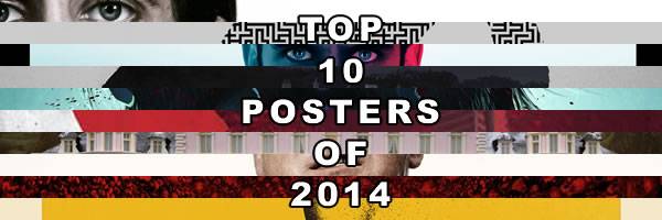
I love a good movie poster because they're so hard to come by. Studios usually play it safe and keep artistry out of it, which is surprising because you don't want your film to be just another advertisement on a multiplex wall. We don't need another poster that uses a blue-orange color scheme, puts in floating heads, kicks up tons of sparks and debris, and superimposes text over a protagonist's face.A poster is supposed to be eye-catching and unique, and these are the top ten posters from 2014 that caught my eye. The parameters for this list were A) The film had to be released in the U.S. in 2014; and B) They couldn't be from a boutique company like Mondo or an individual artist. Hit the jump for my Top 10 Posters of 2014.
10. The Maze Runner

Sometimes, it's best to put the film in the background and go entirely for design. The movie has no stars, so it's not like there's any reason to slap names on the poster. But this one even keeps the title miniscule in favor of emphasizing the "maze" and "runner", and combining them to create a mesmerizing image where the monochromatic colors make the character part of the maze and the maze a part of the character.
9. The Grand Budapest Hotel

Putting "in a film by Wes Anderson" on this poster is unnecessary. Do you look at this poster and think, "Hmmm. I wonder what that Michael Bay is up to now…" The poster may be packed with the names of the film's terrific cast, but it emphasizes that Anderson and his singular aesthetic are the true stars of the picture. And while the movie may not be a blockbuster in the traditional sense, the opulent hotel shows that this will be the director's biggest film yet.
8. The Guest

The Guest feels like a throwback, and this poster follows suit. Other posters for the movie attempted to make it look sexy because Dan Stevens is certainly an attractive gentleman. But this U.K. poster conveyed a more accurate idea of the picture by pushing the sinister nature of Stevens' mysterious character. The colors and the logo font also show that viewers are in for a movie that will feel like it's from the 1980s rather than the present day.
7. Nymphomaniac

There were many horror films in 2014, but Nymphomaniac had the most horrific poster by providing a half-naked photo of Stellan Skarsgaard having an orgasm. It let you know that Lars Von Trier's latest film wasn't only a provocative piece about sex, but also that the marketing department didn't care if they scarred you for life.
6. Foxcatcher

Part of this poster feels like it's playing on Steve Carell's makeup job, but I'm more struck by how it plays into the movie's theme regarding old wealth and class struggle in America. John du Pont (Carell) is part of an American dynasty and his profile looks like it could be on currency, except here we see that it's been torn away. It represents the prestige du Pont tries to buy with his Foxcatcher team, and the tear also hints at the violence and torn psyches of both du Pont and wrestler Mark Schultz (Channing Tatum).
Continue Reading Top 10 Posters of 2014
5. Blue Ruin

The grotesque imagery certainly grabs your attention, but what I love about the poster is the sadness of the main character, and how it's an honest depiction of the film distilled into a single image. Dwight (Macon Blair) isn't a violent man, but he's going to do some very violent things, and he's sadly resigned to his fate. Violence rarely looks so hopeless.
4. Enemy

It was difficult to choose just one poster for Enemy, but I liked this one the best. I liked that it had the confidence to not use its star's face, and the style evokes an earlier era, which works because the film has an eerie, timeless feel to it even though the story employs modern technology. Most of all, the poster cleverly displays the central conflict of a man who meets his doppelganger, and how both lose their sense of self in the process.
3. Nightcrawler

The close-up on Jake Gyllenhaal's face in this poster is certainly effective when combined with the pop-art style, but it doesn't convey the sheer eeriness of this one. Gyllenhaal looks absolutely ghoulish, and while his character Lou Bloom might show a smiling face to the outside world, this image capture his empty soul and alienation from the rest of the world. Bloom is a deeply creepy character, and this poster expertly showcases his unnerving demeanor.
2. As Above, So Below

This is a remarkable piece of design that expertly teases the movie, which is impressive because it's difficult to make the Eiffel Tower look horrific. It turns out the key is to put it against a red backdrop, turn it upside down, and pair it with a million skulls. It's a shame that the film flopped because it would be neat to see this design with other travel destinations such as the pyramids, Big Ben, and Disneyland.
1. Godzilla

Like Enemy, there were plenty of good choices for Godzilla, but this one has the most to love. The red circle is a nod to the character's Japanese origin; the white backdrop is rough and dirty; the minuscule human figures emphasize Godzilla's size; and we get a good view Godzilla, but the shading still obfuscates him somewhat and gives him a mythical quality. It's a poster worthy of its legendary eponymous character.
For more of our Best of 2014 coverage, browse the links below:
Movies
- Perri's Top 10 Films of 2014
- Best Worst Movies of 2014
- Perri’s Top 10 Horror Films of 2014
- Best Cinematography of 2014
- Adam’s Top 10 Films of 2014
- The Top 10 Scores of 2014
- 10 Best Surprises of 2014, From Emily Blunt as an Action Star to THE LEGO MOVIE Not Sucking
- 5 Great Film and Music Moments From 2014
- 10 Great Films of 2014 You May Have Missed and You Should Absolutely Watch
- Oscar Beat: For Your Consideration – Overlooked Films, Performances, and Directors from 2014 That Warrant Recognition
TV
- Comicbook Countdown: The Best Comic Book Shows of 2014 Including ARROW, THE FLASH, CONSTANTINE, GOTHAM, S.H.I.E.L.D., and THE WALKING DEAD
- 10 Best TV Episodes of the Season Thus Far
- Allison’s Other TV Bests of 2014
- Allison’s Top 12 Returning TV Series of 2014
- Allison’s Top 12 New TV Series of 2014