As a movie ends, you may find yourself glancing up at the screen to catch a few of the end credits before gathering up your popcorn bucket and making your way out of the theater. Some end credits sequences are more striking than others, but by and large, audiences rarely take notice of the work that goes into creating these main titles. That somewhat shifted with the Marvel Studios films, as fans quickly learned that if they want to see the post-credits stinger, they better stick around for the entire credits sequence. This May’s Avengers: Age of Ultron gave us one of the most impressive Marvel end credits sequences yet (though I’m also fond of Iron Man 3’s throwback TV show vibe), but you may be surprised to learn that the sequence went through many different permutations before ending up where it is now.
The folks over at the motion graphics company Perception (via /Film) were enlisted by Marvel to craft the end credits sequence to the Avengers sequel, and they’ve shared an inside look at their work online. The brief from Marvel was “open ended”, meaning the Perception team had free reign to come up with whatever types of designs they wanted to. As such, they presented the following four options to Marvel Studios:
Direction A – Hive Mind
Inspired by Ultron’s hive mind ability, which enables him to animate and control entire armies of robots simultaneously, this direction uses swarms to create and reveal imagery and character specific objects for each title card.

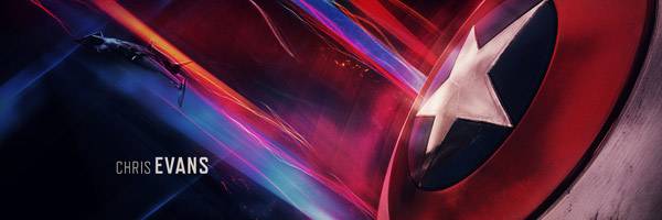
Direction B – Crackle
For generations, Marvel fans have loved the incredible renderings of power and pure energy that have lifted off the comic pages emanating from their favorite heroes and this direction takes its inspiration from those classic panels.


Direction C – Iconic Moments
Bold icons encapsulate characters, locations, and plot points into simple and clever forms while rich environments give moody context to each symbol, suggesting endless layers of iconic moments.

Direction D – Earth’s Mightiest Heroes
Inspired by heroic war monuments and classical sculpture, this direction involves the crafting of a full Avengers sculpture that freezes their most epic face-offs within the monument of war.

As you well know, Marvel and writer/director Joss Whedon eventually favored the latter, which presents the Age of Ultron characters as larger-than-life heroes to be forever remembered. But it’s fascinating to see the wildly different iterations that could have been.
For an even closer look at the different versions, as well as a rundown of the different opening titles—which Marvel Studios wanted to reflect a “night is falling” theme in contrast to the first Avengers’ “sunrise”—head over to Perception’s official site. For more of our Age of Ultron coverage, peruse the links below.