As the movie business caters itself more and more to foreign box office receipts and streaming platforms, the front-and-center movie star design approach to movie posters seems to have increased. However, because movie posters are now seen in many arenas other than theatre lobbies. Whether they're online only, exclusives for film festivals, or animated motion posters for social media, there is more than one shot for many films to show off their designs. And hiding or outright eschewing the actors—in favor of illustrations, negative space, landscapes, retro throwbacks and interesting fonts and graphics—is a personal preference for Collider.
Matt Goldberg and Brian Formo have rounded up their collective 15 favorite poster designs for your perusal. Some of these films were big hits, some are documentaries, some already have a cult following, and some (ahem Lost River) aren't good movies at all. The quality of the film doesn't matter for these selections, just the quality of the design. And 2015 had a lot of great designs.
The 15 below are presented in no particular order, and though we're currently in the throes of a Star Wars: The Force Awakens frenzy, it should be noted that as lovely as the one-sheet is, it's part of a design template the films have used since 1977. Feel free to let us know your favorite posters of the year in the comments.
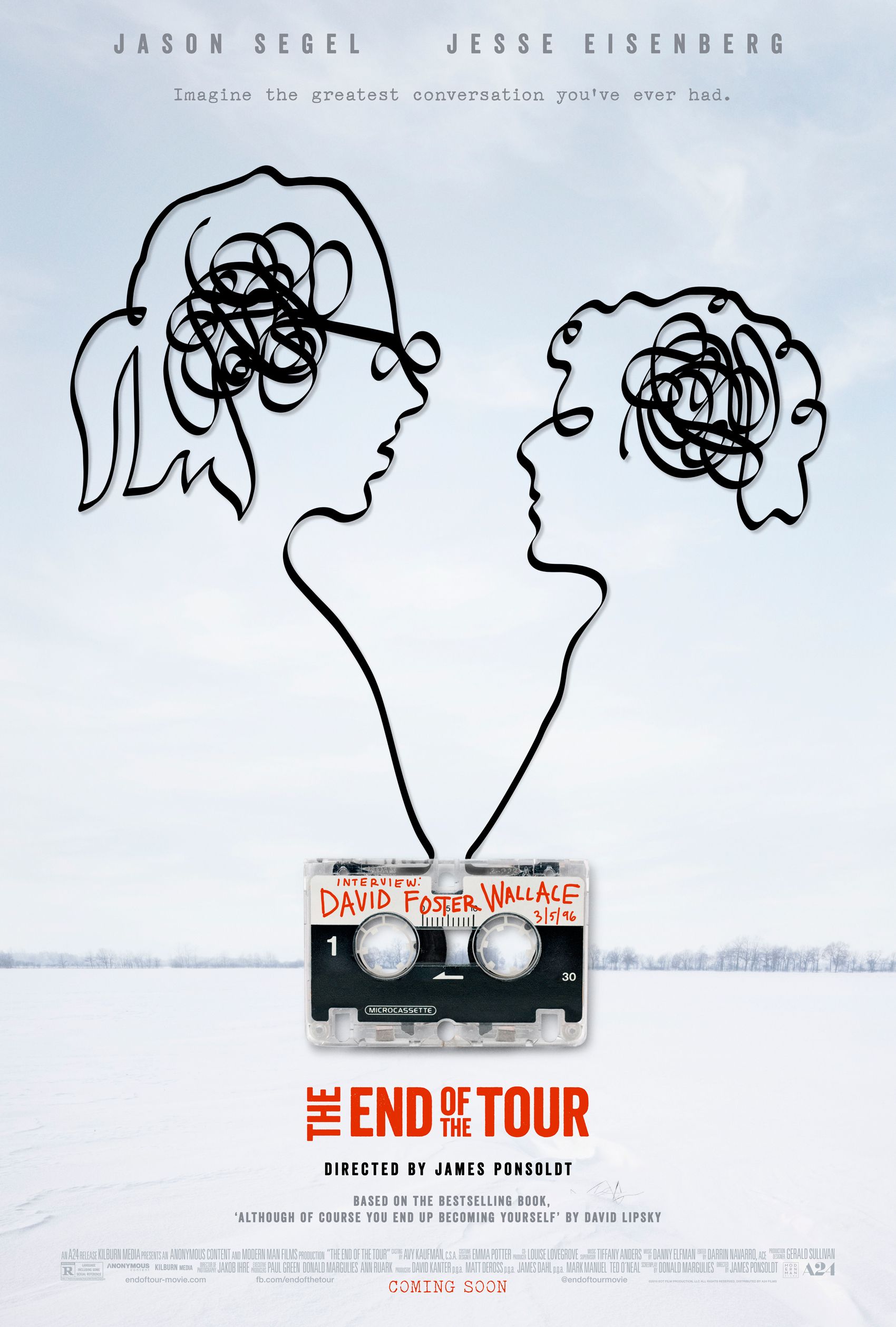
The End of the Tour
While the squiggle heads might appear to be an attempt at John Lennon Imagine imagery, this one sheet for The End of the Tour actually perfectly encapsulates the movie—if you know that it's a a drama about a hotshot author, David Foster Wallace, and a hotshot Rolling Stone journalist. For one, the squiggles come from the audio cassette used to record their interview—but the audio cassette is more than a prop in the film. The closeness of one spool of tape (from author to journalist) to the other (and how they loop together) conveys both the similarities and conversational battles the two writers will get into over the course of a book tour.
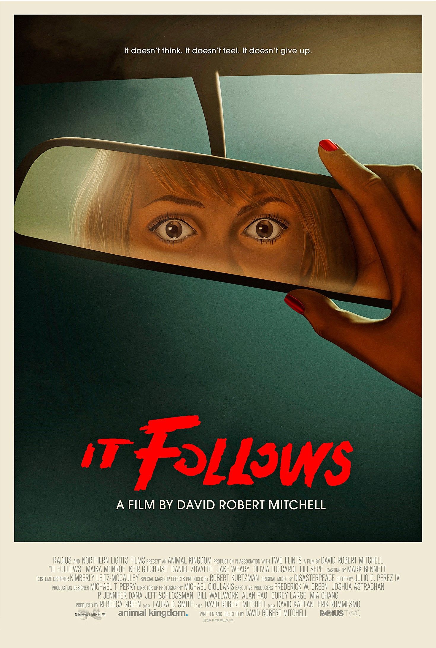
It Follows
I’m a sucker for retro art, and this poster would be right at home on an old, beaten-up VHS box. The visual of looking in the rear view is also a sly play on the slasher poster and a neat way to convey that while we would normally expect to see the killer in the backseat, the shapeless, shifting monster of David Robert Mitchell's horror flick doesn’t give us that minor comfort. - Matt Goldberg
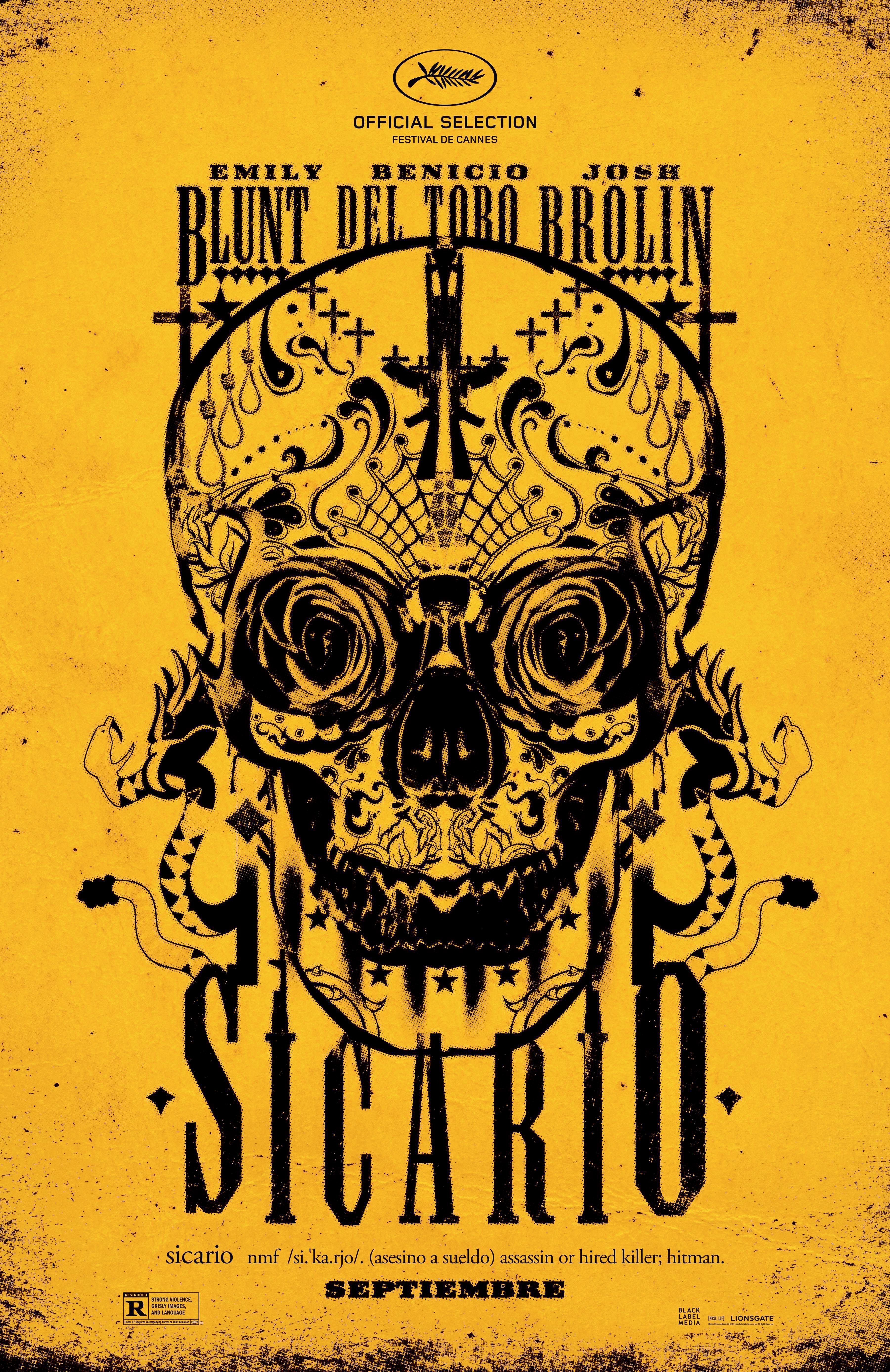
Sicario
This Mexican cartel thriller had a ton of great posters to choose from (including a few that mimicked the design of tarot cards), but we're choosing this one that takes a Dia de los Muertos rose skull, strips it of its color and sets it atop an industrial and toxic yellow. Looking like a weathered road sign on a secluded road, it begs to be shooting target. - Brian Formo
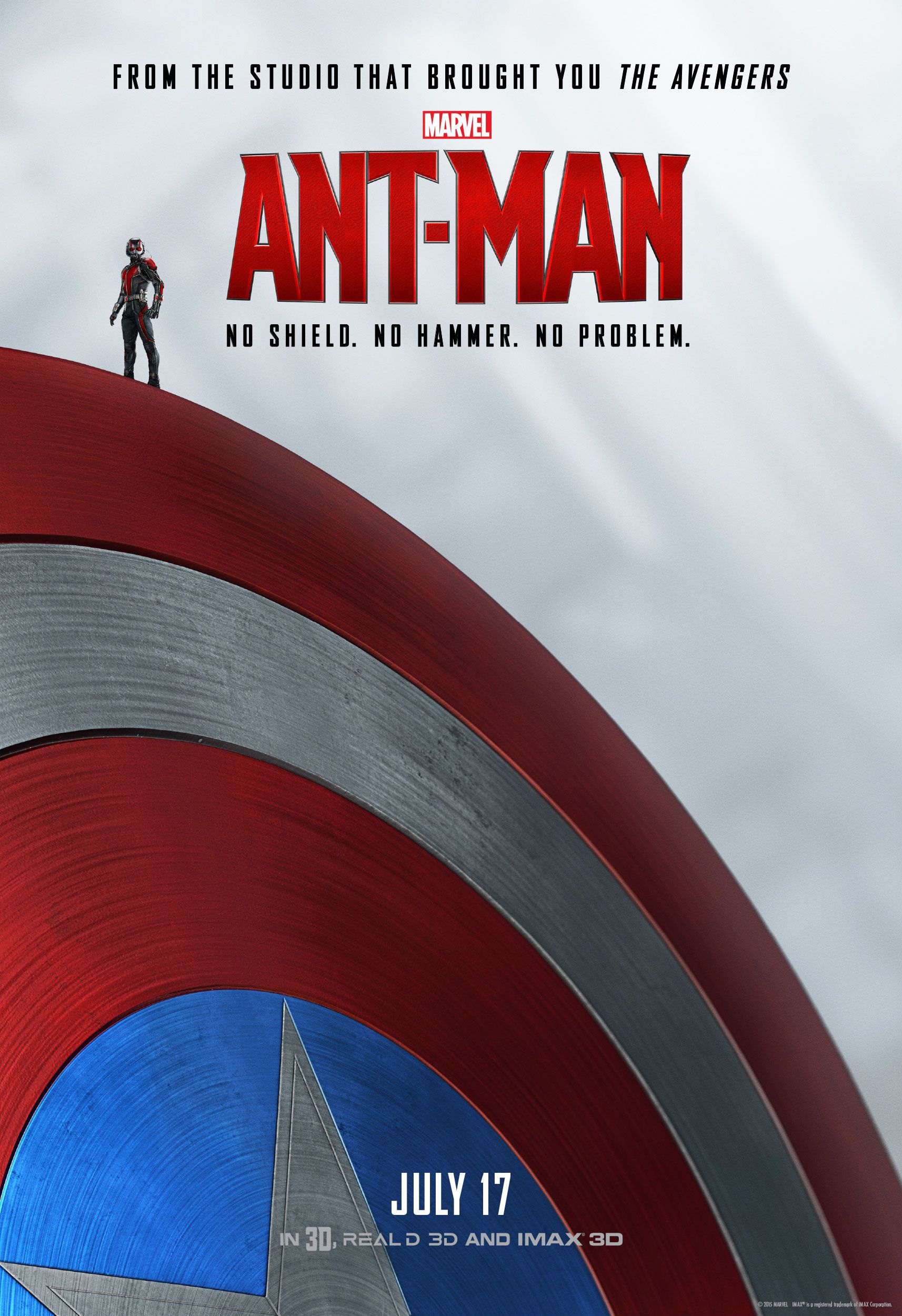
Ant-Man
Marvel wasn’t above using its successful franchises to help catapult the little guy to success, but they did it in a cheeky way with posters showing Ant-Man standing atop the iconic weapons of other heroes. These posters told audiences that Ant-Man may have a silly name and his powers may be unclear if you’re unfamiliar with the character, but he’s fit to stand with the heroes you’ve already come to love. - Matt Goldberg
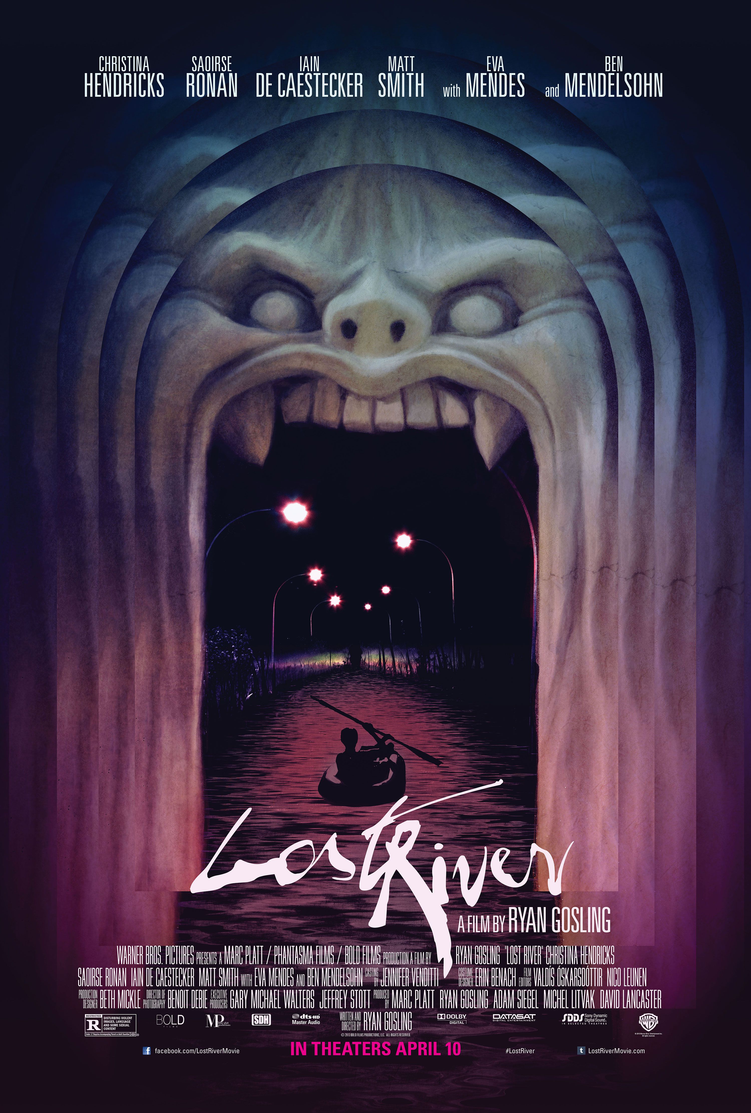
Lost River
Ryan Gosling's first directed film gets the creepy funhouse treatment for the one-sheet. While it's an enticing design that harkens back to 1980s VHS horror covers it adds a nice nod to the posters given to Gosling's Drive and Only God Forgives director (Nicolas Winding Refn) by making the river glow from pink neon lights. - Brian Formo
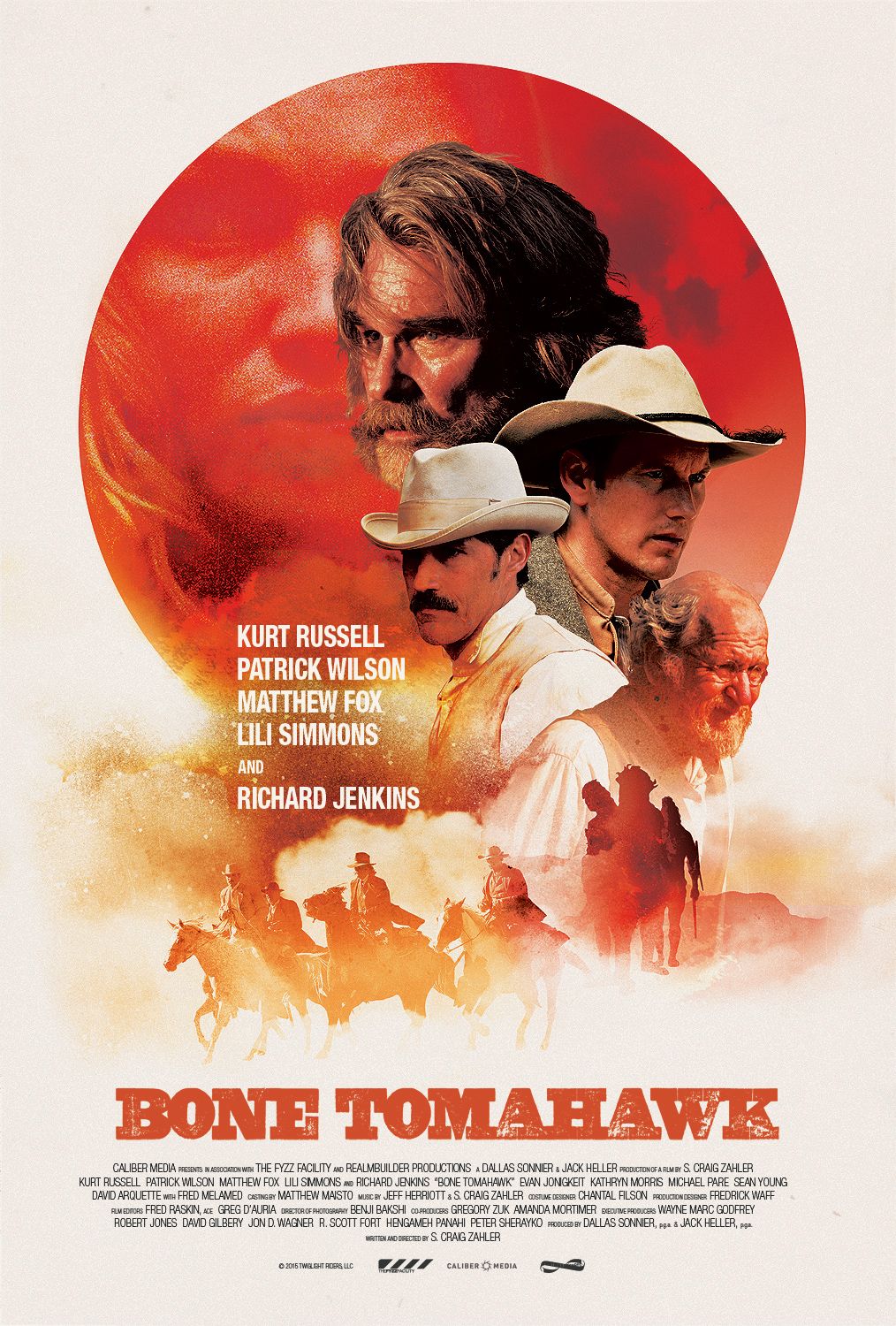
Bone Tomahawk
Again, I dig the retro approach to poster art and with Bone Tomahawk, the artists made a solid callback to older westerns. The film itself is an odd hybrid, and I’m glad that rather than play up the horror elements, they tried to find a way to convey the sense of dread on the frontier where even someone as manly as Kurt Russell looks a little worried. - Matt Goldberg
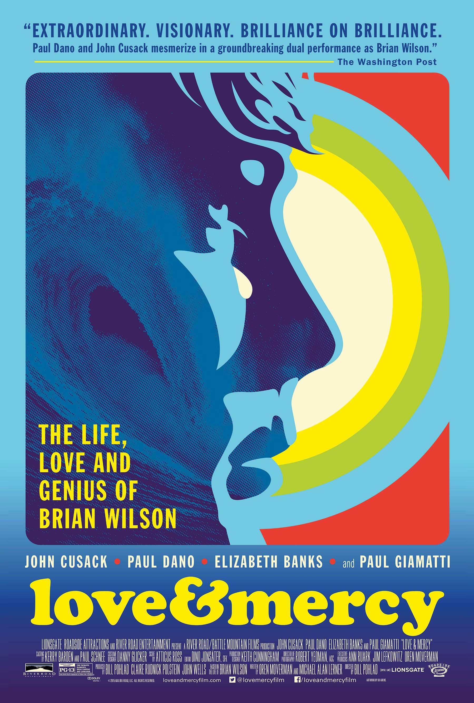
Love & Mercy
Instead of recreating one of the classic album covers of the Beach Boys for this Brian Wilson biopic—whose albums were generally staged glam shots of all the band members—the one sheet for Love & Mercy favors the type of compilation artwork that would accompany their many Greatest Hits albums: bright colors, a surfer, and a wave. As the most beguiling sections of the film serve as a compilation of how Wilson assembled all the strange arrangements that made the Beach Boys unique pop superstars, this Greatest Hits design approach is appropriate. - Brian Formo
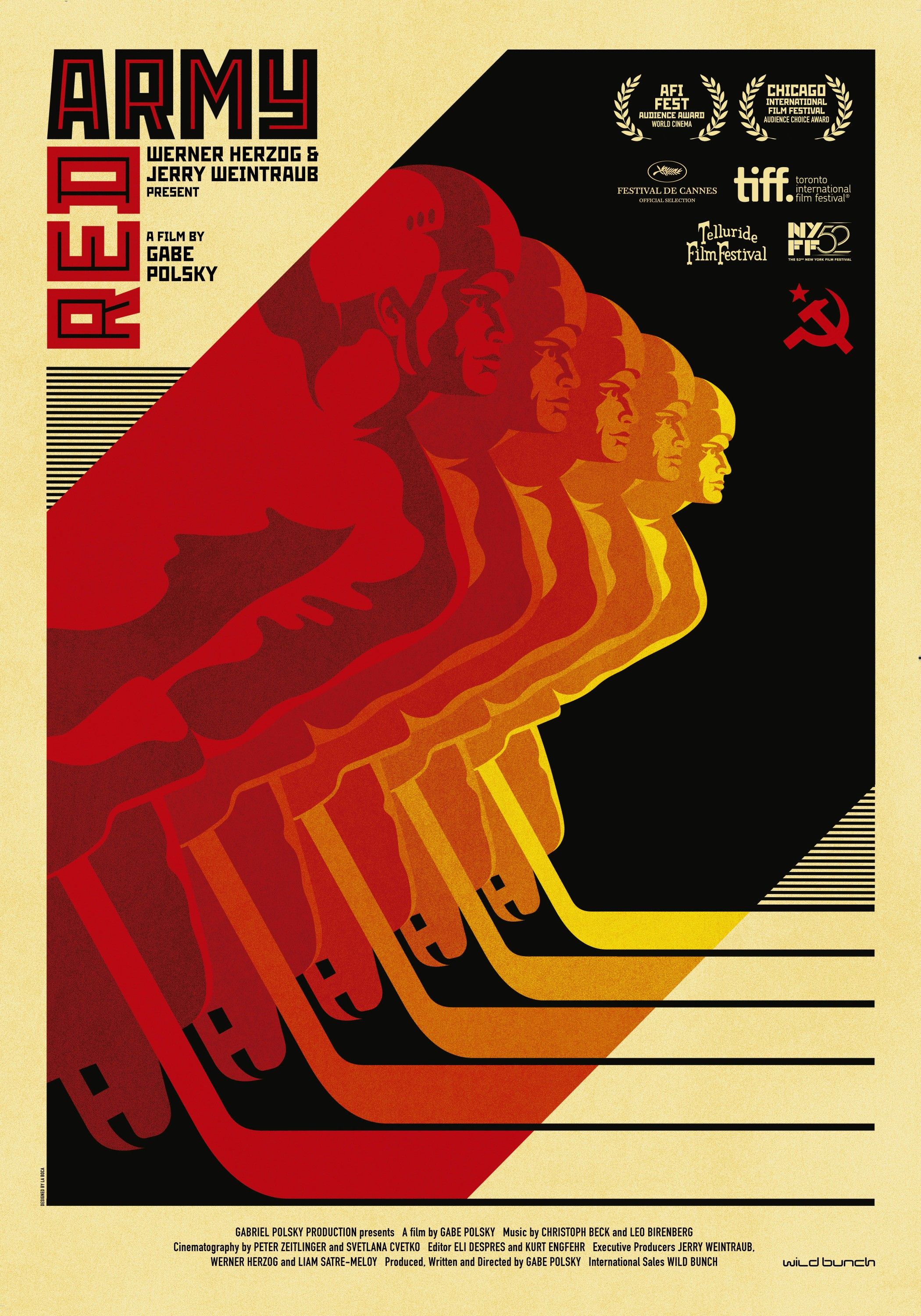
Red Army
It’s hard for small documentaries like Red Army to get any attention, but the makers behind the poster did their best by choosing to invoke Soviet-style art to sell Gabe Polsky’s film about Russia’s famed hockey team. It’s colorful, catchy, and damned clever. - Matt Goldberg
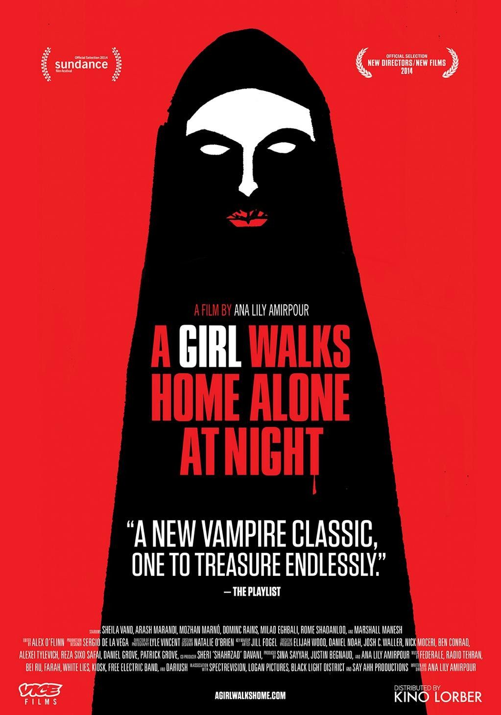
A Girl Walks Home Alone at Night
A Girl Walks Home Alone at Night was a 2014 festival film that received a wider release in 2015. With that wider release came this fantastic poster, which shows a hijab-wearing vampire—which shapes her like a tombstone, but highlights her femininity via her cracked lipstick—for this Western-Iranian-horror mashup flick. - Brian Formo
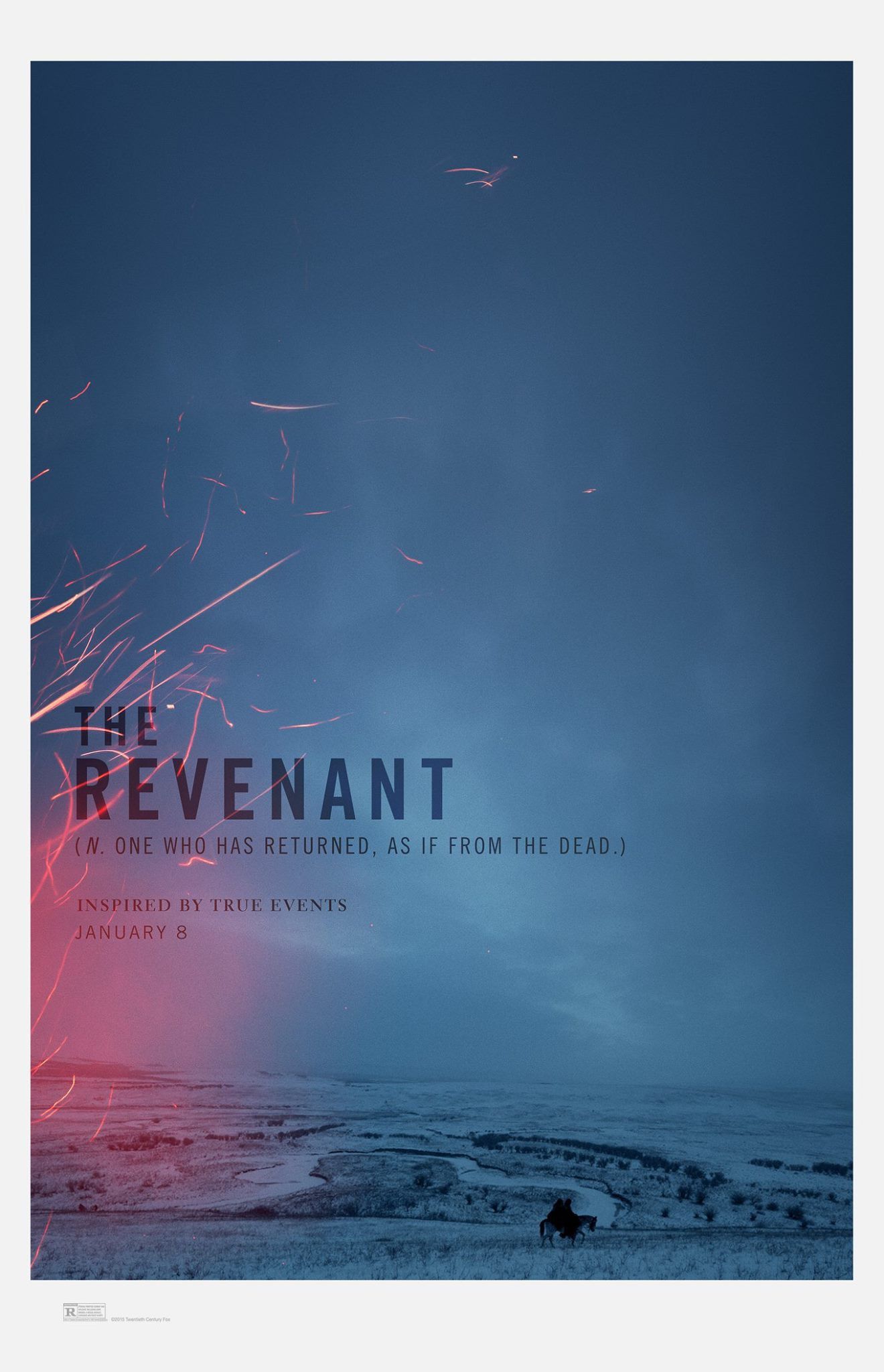
The Revenant
This is perhaps the ballsiest poster of the year to the point of being foolish. Not only does this teaser poster not show its A-list stars, Leonardo DiCaprio and Tom Hardy; it doesn’t even include their names. Instead, it gives attention to the gorgeous visuals and hopes that the stark look and a definition re-appropriated into a tagline will capture your attention. - Matt Goldberg
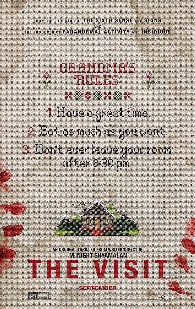
The Visit
There are rules for every horror film and often they are explained on posters. This one sheet for M. Night Shyamalan's newest is welcome to Visit because it takes the classic "home sweet home" cross stitch, adds some bloody fingerprints, sets up the rules, and easily conveys the price for breaking those house rules. - Brian Formo
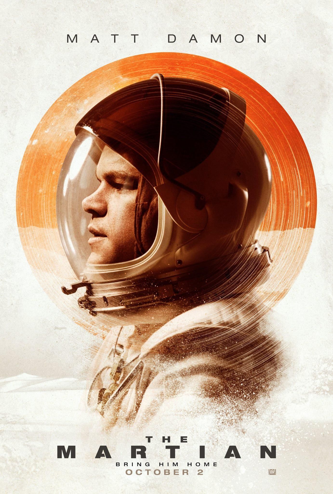
The Martian
I really like the subtlety of this image where the red orb of Mars becomes almost a second helmet for astronaut Mark Watney. It encases him in a way that’s not malevolent but not protective either, and I like the way that sentiment comes across on this poster. - Matt Goldberg
Maggie
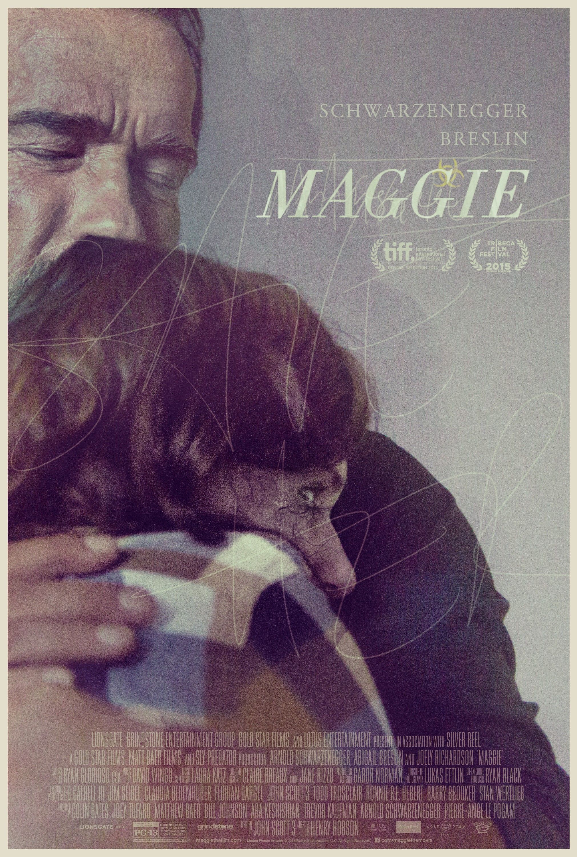
Pushing star Arnold Schwarzenegger into the corner of the poster and obscuring most of his face in favor of his daughter's back and a glass-carved plea for help is a unique approach for a unique biohazard film. The image conveys the family drama, the scraping-text implies the horror, and the biohazard symbol lets you know that there's some toxic event (bonus points for making the symbol small and behind the title). This one's elegant, natural, and surprisingly subdued. - Brian Formo
Finders Keepers
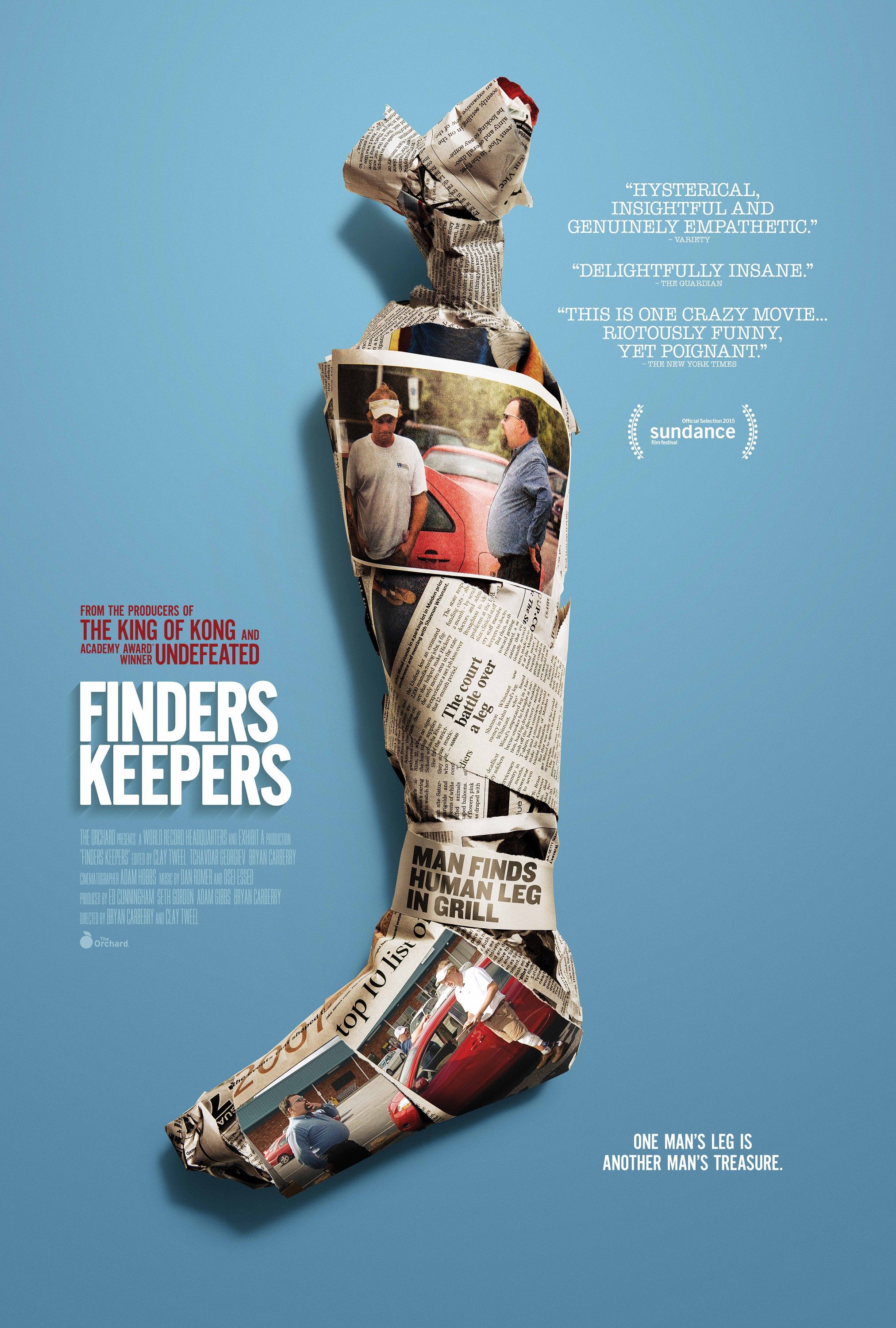
While I wish the headline “Man finds human leg in grill” was a bit more prominently displayed on the wrapping, it’s still a smart way to convey the plot of this stranger-than-fiction tale. There was no way to convey the film’s depth on the poster, but this simple image at least arouses your curiosity, and hopefully will push you to eventually seeking out one of 2015’s best documentaries. - Matt Goldberg
Queen of Earth
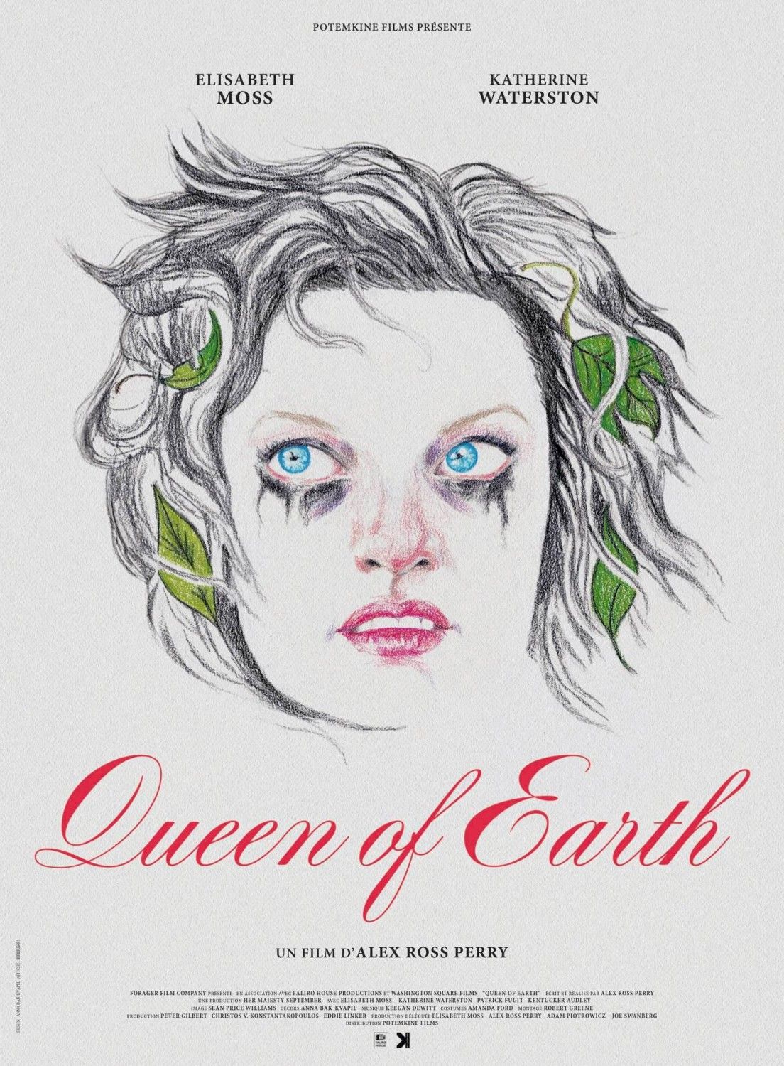
Rather than rely on the beauty of star Elisabeth Moss, this artwork makes her look like a mascara-stained phantom. It lets us know that this movie will definitely be a bit of a trip and one where the straightforward path is likely nowhere to be found nor desired. - Matt Goldberg


