I love movie posters. I've had them littering my wall since middle school, and I'm always impressed when a studio takes a chance on a design that isn't a floating head or a blue/orange color scheme. Too often, studios play it safe, but when they go outside the box, they can come up with something you want to take out of the multiplex and bring home. It not only sells the film; it elevates the film by mere association.
With the help of the exhaustive IMP Awards archives, I went through thousands of studio released posters (meaning no Mondo or other boutique posters) and whittled it down to the fifty I thought were the best. These posters played with art style, perspective, or just went above and beyond in some way that was clever, daring, and unforgettable. Every film on this list may not be great, but it definitely had a great poster.
To check out the worst posters of the decade, click here, and be sure to check out all of our Best of the Decade content.
50.) Devil
Just try to ignore the "From the Mind of M. Night Shyamalan" at the bottom and you have a very cool, very aggressive image that does a good job selling a film that has no stars.

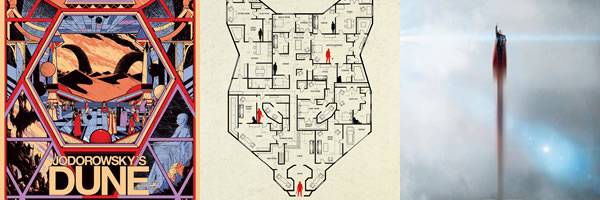
49.) Sound of My Voice
This one may get a little too deep into the film its promoting at the cost of alienating those who don't get the reference, but it looks nothing like any other poster out there, and that's enough to get you wanting more.

48.) Wonder Woman
Even if you removed the word "power" from this poster, it would still convey that sentiment through Wonder Woman's stance, the lighting, and the colors.

47.) Blackkklansman
I love the dark comedy of this poster, taking the horrific symbolism of a klan hood and then tearing it down with a black power stance. It also conveys the entire plot of the movie in one image, which is of a black cop impersonating a klansman.

46.) The Martian
This thoughtful design shows that Mars not only occupies Mark Watney's mind; it's also his prison.

45.) The Master
Give me a good throwback poster any day. I like how the poster conveys the 1960s technicolor style of the movie while still being sly and sinister in its own right.

44.) Suicide Squad
You have a poster that needs to convey a lot of characters (even Slipknot is on here!) and so composition becomes everything. The designers found an ingenious way to do it by transplanting them all into a colorful mushroom cloud to convey the destructiveness and unpredictability of these characters.

43.) The Devil's Double
If you were walking by this, you would have to stop and look twice. The gaudy, saturated gold demands the viewer's attention and makes he or she want to know more.

42.) The Cabin in the Woods
While it may not have the punchy taglines of earlier posters for the film ("If you hear a strange sound outside...have sex."), this poster does a great job of teasing the mystery of the film rather than playing on horror beats. Its how you sell subversion in a single image.

41.) 127 Hours
This poster wins points for sheer cleverness. I went for years without spotting that this is an hourglass.

40.) Queen of Earth
Elisabeth Moss has certainly looked better, but these portraits turn her face into a haunting visage that makes you curious to know more about the film.

39.) 42
A dynamic image that makes terrific use of motion as well as perspective to make Jackie Robinson's movement come off as both triumphant and exhilarating.

38.) The Snowman
If we made a list of the best AND worst poster of the decade, all entires would be this one. This poster is so bad and so silly that it comes back around to being good. Surprisingly, the ineptness of this poster--trying to be scary and instead being comical--is a good reflection of the inept movie it's selling.

37.) Felt
Another word you could put on this poster is "provocative" and if you needed another, "fetishistic" would do. It's a daring use of perspective, flesh, and it demands your attention.

36.) Finders Keepers
Credit to the designer here for finding a funny way to tell the film's central conflict, which is about the fight over a severed leg.

35.) The Heat
A nice throwback style action poster, this looks like it belongs on the cover of a bootleg VHS box, which only adds to the overall charm of the poster.

34.) Thor: Ragnarok
Marvel finally figured out how to do symmetry in their posters starting with this one. It's bright colors help show that this is a far cry from the last two Thor movies and still manage to bring in all the major players from the story.

33.) Baby Driver
This is a terrific teaser that helps sell the movie as a stylish crime thriller but based around speed and sound. There are only a few design elements here (gun, wavelengths, car) but the composition is perfect.

32.) Us
One of the best horror posters of the decade, the poster for Us shows the doppelgängers in a really clever way, asking who's the real person who's the imitator? The terrifying expression on Nyong'o's face just adds to the tension.

31.) Deadpool
Leave it to Deadpool to parody marketing in general. If you're going to sell your R-rated superhero action film in a different genre, you may as well do a complete 180 and play up the Valentine's Day release date.
