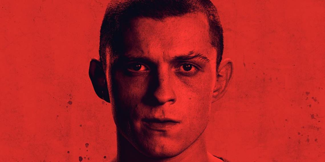
Something very strange happened today with the release of the FYC poster for Cherry, the upcoming, muckraking film starring Tom Holland and directed by The Russo Brothers. As tweeted out by film reporter Chris Evangelista, the first poster we all saw was, well, "appallingly bad". Holland was bathed in an appropriately cherry-tinged red, yes, and he looked appropriately dark and disgruntled. But the actual title of the film looked a little less "Cherry" and a little more "Cherrk". What was going on with this title design choice? Why are we sacrificing the "actual title of the film" for "artsy edginess"? Why does it simply say "Best Picture" atop "Cherrk"? And can we please officially rename the film "Cherrk" so we can all laugh until we cry when Warren Beatty tries to read its Best Picture winning envelope?
And then, the plot thickened. This was not the official FYC poster design for the film, said Variety in a tweet. "Variety apologizes for our mistake in the digital misprint of the ad for the film 'Cherry,'" they explained. "This is not up to our standards." And the new version of the poster looks, well, pretty much the same, except now you can read the actual word "Cherry" (RIP "Cherrk"). What the heck happened?
UPDATE: Since originally publishing, we received word from the publicity team behind Cherry "that the poster glitch was due to a Chrome issue," meaning something involving the popular web browser Google Chrome.
And is it just me... or is the "Cherrk" version more interesting than the "fixed" one?

For all the clowning on "Cherrk", and all its aggressively posturing "edginess", it's at least a "choice" in the often dreary world of film posters; without it, it's just Tom Holland looking sad at us, an Apple promise uptop, and the assurance that it's deserving a look at being "Best Picture". With it, it makes you squint harder, grabs your attention, and demands you figure it out.
And this sort of active, if inadvertent, disruption likely communicates the intent of the film itself. In our exclusive panel with the Russo Brothers, they explained that the film takes a purposefully wild, aggressive, unorthodox approach to its visual and narrative storytelling. I'll let Joe Russo explain it:
"The film is about [Holland's] life cycle. It’s about a 15-year life cycle. And it’s broken into chapters where each chapter is shot almost as if it was a different film, but they’re all connected in a way. But there’s a gonzo element to it... there’s magical realism in one chapter and then absurdism and then brutal realism and then horror and then dark humor, so it really covers a wide scope of experience both for the character and for the audience. Each chapter we made very distinct cinematic choices from costume to performance to lenses to the style of camerawork to the way the camera moves to music. It’s hopefully not a jarring shift for the audience, but it does move and take you places that you’re not expecting from chapter to chapter. And when you put it all together as a whole, hopefully you get a surprising and unique moviegoing experience."
So in a film this willing to be weird, this genre-hopping, and this "gonzo"... why not release a poster that says it's called "Cherrk"? I'm calling it: Hire whoever made this mistake for your official design team, Russo Brothers!
Check out both Cherry FYC posters — first its "real" version, and then its originally-dropped "broken" version — below. The film comes to select theaters February 26, 2021, and then on Apple TV+ March 12, 2021.
