Earlier in the week, we ran a brief preview about Gallery 1988’s latest show, a “three-man solo show†featuring new art from Jay Shaw, Jeff Boyes, and Josh Budich. At the time, we shared about half a dozen pictures, bringing you what may or may not’ve been your first look at Shaw’s Klute and Invasion of The Body Snatchers, Budich’s Sorceress and Tetsuo, and—last but not least—the one-two punch of Boyes’ Eternal Sunshine of The Spotless Mind and The Wolf Mobile (based on the original Teen Wolf). Those pics were all great, to be sure, but they did leave us a little wanting...but all that’s over now.Wanna see every other print that’s on sale via the good folks at Gallery1988? Meet me after the jump, folks (and be sure to bring your wallet). If you’re a screenprint collector, then I probably don’t need to tell you that this summer has visited quite the merciless beating upon bank accounts everywhere:  the Alamo Drafthouse’s Summer of ’82 series kicked things off a few months ago (accompanied by new Mondo prints based on ET, Star Trek II: The Wrath of Khan, and Rocky 3, and Drew Struzan’s insta-classic screenprint for The Thing), while Gallery1988 held an Arrested Development-themed gallery show, Mark Englert released prints based on Stephen King’s It and The Walking Dead, and the good folks at The Phone Booth Gallery dropped three new sets of prints by Martin Ansin, Rich Kelly, and Ken Taylor. All of that was followed by the tenth Mondo Mystery Movie, an event that kicked-off Mondo’s Lord of The Rings series.Oh, and then Comic-Con happened, and everyone who wasn’t already broke by then skipped right over that step and went straight into “all-out homelessness†upon returning from the Con (pro-tip: use your GID prints as blankets once night falls and you’ll be 50% less likely to get run over while sleeping beneath that overpass). And so, when I returned home from the Con and found out that Jay Shaw, Josh Budich, and Jeff Boyes had just announced yet another event worth traveling outta town for, I swore to myself that I’d exercise a little self-control (for the first time in months!). In other words, I promised myself I wouldn’t buy another poster until all of August’s bills were paid.Go on: guess how that turned out.JAY SHAW: PARANOIA-DRENCHED FILMS FROM THE 60’s AND 70’s (OR: “HOLY SHIT SOMEONE MADE A POSTER FOR THE CONVERSATIONâ€)First up, we’ve got a selection of striking images from Jay “Iron Jaiden†Shaw, last seen unveiling a pitch-perfect poster based on Mimic at Comic-Con. I had a chance to speak with Jay earlier in the week, and asked him if he could tell me a little about the series he’d produced for Gallery88’s latest show. Here’s what he had to say:
Beginning in 1962 with John Frankenheimer's brilliant film adaptation of Richard Condon's novel The Manchurian Candidate a handful of American filmmakers began telling stories of corrupt nefarious forces embedded in the highest levels of authority of our country. Throughout the 1960s and 1970s with the war in Vietnam, various political assassinations and very public scandals like Watergate the American public trusted their leaders less than ever before. Films like The Conversation, All the President's Men and Three Days of the Condor underscored the sociopolitical climate of the era and resonated with audiences looking to affirm their own personal paranoias and distrust of the established power structure.
I made a handful of simple single color posters paying tribute to some of my favorite conspiracy films of all time.
You’ll probably recall that Jay’s previous gallery effort—a one-man show at the Mondo Gallery entitled Don’t Go Out Tonight—was also based on creepy cult films from decades past. The vital difference between that show and this one (in our opinion, anyway)? We’ve actually seen most of the movies represented in the Gallery1988 series, and some of ‘em are amongst our very favorite movies. Don’t Go Out Tonight was a great show, of course, and its success is absolutely a testament to Shaw’s talent…but I gotta admit I’m digging this particular series even more, and not just because it includes a print for The Conversation.
Let’s check ‘em out. For brevity’s sake, be aware that every print in Shaw’s series was 18x24â€, that each was numbered out of an edition of 100, and that each print sold for $30 (we just double-checked, and Gallery88 confirmed that every print that’s still available for sale will drop at the G88 website later today, so keep your tabs open, your fingers crossed, and your F5-button in motion). Without further ado…
Let’s say it again, because what else can one say: holy shit, someone made a poster based on The Conversation. Bravo, sir.
Click on over to Page 2 for much more, including prints for Jaws, Ghostbusters, Drive, and Akira.
Page 2
JOSH BUDICH’s SISTENE POP FEATURES PRINTS BASED ON AKIRA, JAWS, GHOSTBUSTERS, MORE
So, Jay Shaw took on paranoid thrillers from the 60’s and 70’s, and he did it using a pretty-damn-bold black-and-white-only color scheme. Another ballsy move on Shaw’s part, and another check for the “Win†column. But what of artist Josh Budich? What did he have planned for the show? We discussed that earlier in the week, at which time Budich pointed me towards the following quote (which explains his “Sistene Pop†theme):
I was honored when Gallery1988 asked me to do a 3-man solo-show with Jeff Boyes and Jay Shaw. The show will open at G1988′s Venice location, Thursday, August 2, from 7-10pm PST, and the art will be on display through August 25. I’m headed out to the West Coast for the opening. Hope to see you all there! My theme is an attempt to marry my study and love of the classical Renaissance masters (personal fav Michelangelo), with all my childhood obsessions and influences from pop-culture/toys, etc. So, I placed bigger-than-life characters within the Sistine Chapel environment, elevating them to an even grander iconic stature. Similar to the way Michelangelo did with the biblical Prophets and Sybils.
As was the case with Shaw’s series, all of Budich’s “Sistene Pop†prints were almost identical: each print was selling for $40, was numbered from an edition of 60, and all measured 18x18â€. The only thing that changed, print-to-print? The image on the front. And what did Budich’s lineup look like, anyway? We were surprised by our reaction to this series, but see what you think:
Y’know, I wanna point out that this set of prints is easily the best work I’ve seen from Budich since…well, ever, actually. The more I look at the prints in this little series, the more I’m convinced that we might actually be seeing Budich stepping way outside of his comfort zone (you’re seeing this, too, or is this just the mescaline talking?), and that’s been something I’ve felt this artist would benefit from for a long time.
See, to me Budich’s Gallery88 posters feel noticeably looser (I’ll betcha $2 that Budich was having way more fun than normal while getting this series completed), more compelling, and far less obvious.  His likenesses—something I’ve seen Budich take knocks for in the past-- definitely seem to be more accurate (really digging that Brody print!). Colors are great, too. Maybe now it’s the mescaline talking?
Look, bottom line? I always believe in giving credit where credit’s due. It’s true that Budich’s work hasn’t always blown my skirt up in the past…but I was pleasantly surprised by every print he had available at this show (now there’s a sentence I feared I’d never have cause to write). I’m hoping Budich continues to push onwards, outwards, upwards (anywhere but backwards oughtta be fine)…but what do you guys think? How do these “Sistine Pop†prints compare to Budich’s other work? Have I gone mad, or is this not the best work he’s done in a long, long time? Sound off in the comments section below! Then we’ll move on to…
IN WHICH JEFF BOYES IS ALL LIKE, “WAIT, I WAS SUPPOSED TO PICK A THEME?â€
Finally, the third chunk of Gallery1988’s “three-man solo show†belongs to Canadian artist Jeff Boyes, and it’s impressive third. Interestingly, Boyes tells me below that he wasn’t consciously going for any one particular theme: to hear him tell it, he was just using the opportunity to create some prints he’d never had the opportunity to make before. Somehow, he ended up with something that feels pretty damn cohesive, anyway.
Because Jeff was generous enough to talk me through each and every print when we touched base earlier this week, I’m able to do something a little different for this section. First, here’s what Jeff says about the show in general: “Well, I have 7 prints in the show.  I never started out with a theme (in hindsight a theme would of probably made the work go a little faster!), I just took this as an opportunity to do some prints I've always wanted to do, but never had the chance.  As I got into organizing myself with what I was gonna actually produce, half the prints ended up being 80's themed and half were more current.â€
- Point Break Variant by Jeff Boyes
- 18x24â€
- $50 signed/numbered edition of 60
- 3 color screenprint
Jeff Says: “A print that needed to be in this show was a Variant of the Bodhi print (Point Break).  I'm not a huge fan of doing too many Variants, especially 2 years after the release, but a lot of people have been e-mailing me over the last two years about that print, and a while ago I started telling people they had to wait until this show and I'd have something cool for them.â€
- L.A. Massacre (Thrashin’) by Jeff Boyes
- 18x24â€
- $50 signed/numbered edition of 60
- 5 color screenprint
Jeff Says: “From that print I wanted a print that went along with it.  I decided to do a Thrashin' inspired print.  Always loved this movie as a kid.  Christian Hosoi and Tony Alva as Daggers, Also it has a lot of 80's Venice Beach and California in it.  You got the surfing(Point Break) and the skating(Thrashin') in Cali… both things I dreamed about as a kid in Canada. To round out the 80's (although Point Break is early 90's, it still feels a little 80's to me!) I did a more concept driven Teenwolf inspired print and a Spaceballs print.â€
- Wolf Mobile by Jeff Boyes
- 10.5x26â€
- $50 signed/numbered edition of 60
- 4 color screenprint
Jeff Says: “The Teenwolf print was definitely a more "inspired by" print, since he never surfed the wolfmobile as the wolf at night and most of the surfing was in suburbia.  I just wanted to make a bad-ass print of teenwolf and this concept had been in my mind for a while.â€
- Eagle 5 (Spaceballs) by Jeff Boyes
- 10.5x26â€
- $40 signed/numbered edition of 60
- 3 color screenprint
Jeff Says: “For the Spaceballs print I wanted to make something that made you think back to that movie, but also something that could go up on your wall.  Pizza the Hut would have epic to draw but I don't know how many people would hang that on their wall so I chose Eagle 5(the flying Winnabego). I used a metallic black on this one to get that extra starry sparkle.â€
- That’s That (Punchdrunk Love) by Jeff Boyes
- 18x24â€
- $50 signed/numbered edition of 60
- 4 color screenprint
Jeff says: “As for the more current prints.  I chose Eternal Sunshine and Punch Drive Love. Two of my favourite movies that don't get enough print love. The Punch Drunk print was a fun one.  I think I drove Steve at D&L a little mad with that blend in the background.  He did a great job with it though.  Love the iconic blue suit and the phone in his hand.â€
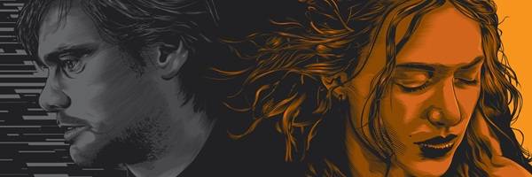
- Eternal Sunshine by Jeff Boyes
- 10.5x26â€
- $50 signed/numbered edition of 60
- 6 color screenprint
Jeff says: “I drew the Eternal Sunshine print with the idea of putting Joel (Jim Carrey) in the shadows of Clementine (Kate Winslet) and then kind of breaking away into segments.  While the movie mostly focuses on Joel erasing Clementine from his mind, I wanted to focus on what happened first and also, I wanted to portray Joel as the one getting screwed.â€
- Drive by Jeff Boyes (AP Edition)
- 18x18â€
- $90 AP Edition of 10 (!!!)
- 4 color screenprint
Jeff says: “Oh, and the last print is my A/P's of the Drive print I did in November.â€
And that, my friends, is that! Please remember that every remaining print from last night’s opening (however many that might be) will be dropping online at the Gallery1988 website sometime this afternoon: while it’s true that some of the show’s prints are already completely sold out, I’ve been led to believe that the majority didn’t…so there’s a reasonable chance that you’ll get at least some of what you’re hoping to buy during today’s online drop, right? Well, depends on how you define the word “reasonableâ€, but let’s not get sidetracked: instead, I’ll wish all of you luck, and hope everyone gets what they want.
Special thanks are in order to Jeff Boyes, Jay Shaw, Josh Budich, and everyone else at Gallery1988: all of you helped us get this piece put together, and all of you were a pleasure to deal with!  To everyone else: please, stay tuned for more Gallery1988-related coverage here at Limited Paper in the days, weeks, and months ahead. They’re having a good year, and it’ll be cool to see what else they’ve got up their sleeves for 2012.
Also: Are you an artist with a kick-ass print that’s about to go on-sale? Are you a gallery (or, more likely, a gallery owner) with a show on the verge of being announced? Got poster-related business you’d like to spread the word about? Are you just a creepy, unwashed drifter who managed to overhear a hot poster-related scoop while stalking, say, Martin Ansin?  If so, drop us a line at LimitedPaper@Gmail.com right away: we’re always looking for new news!  Everyone else can sound off in the comments section below, or-- if you’re not already following us over on Twitter-- head on over to this page to get signed up now (as soon as we hit the 1,000 follower mark, we’ll do a cool giveaway)!
Finally, if you're interested in buying any of the prints featured today head over to the Gallery1988 website.
Until next time, remember: never, ever, ever pay a stranger via the PayPal “Gift†option. Ever.