
I’m kind of fascinated by poster art. It’s part of the reason I do an annual Best Posters of the year article because these mass-produced posters have to both serve a wide audience but also be unique enough to be eye-catching.
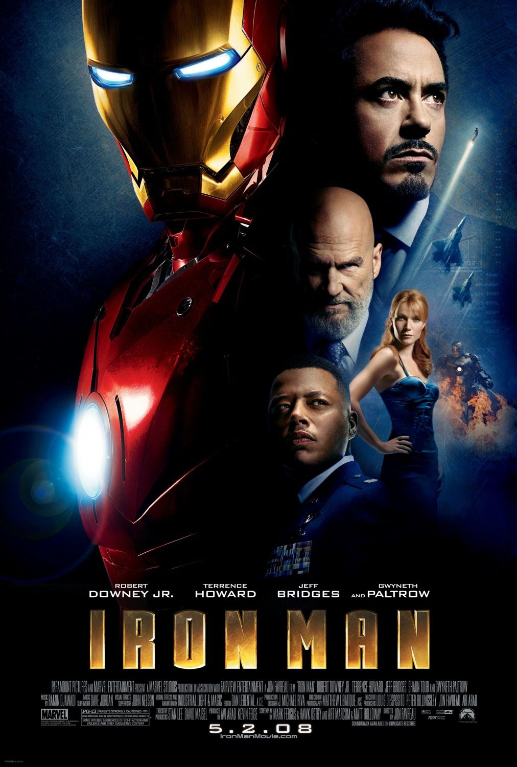
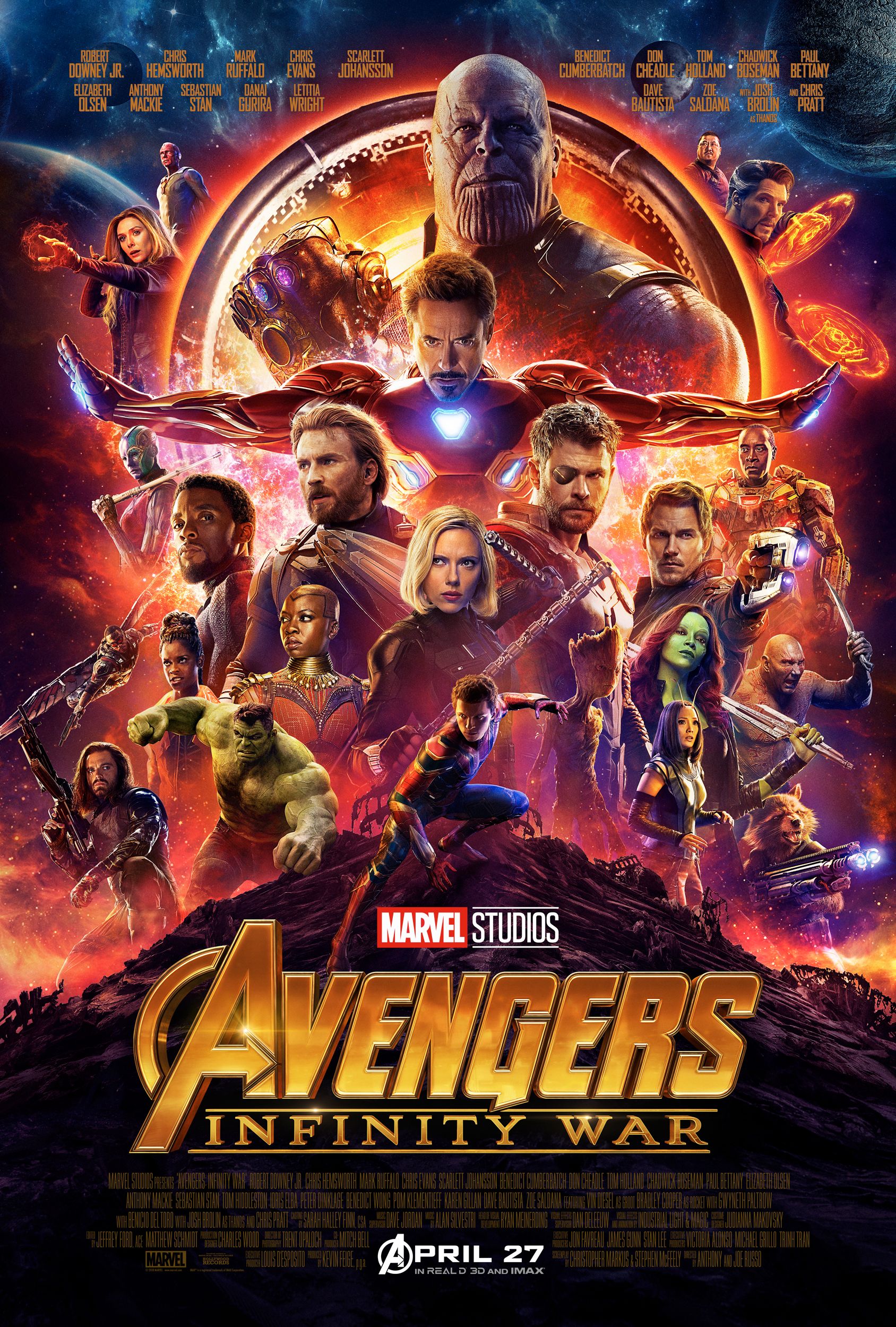
That’s why I love this Vanity Fair video where professional poster artist James Verdesoto, who worked on such iconic posters as Pulp Fiction, Ocean’s Eleven, Girl, Interrupted, and Training Day explains the look of every poster in the Marvel Cinematic Universe. The posters have changed over the years, and while certain techniques continue to reemerge (like the blue-orange contrast), Verdesoto points out what works and what doesn’t in these images. I really admire his honesty here, and rather than trying to play nice with every poster, he’ll come right out and say if something isn’t working (e.g. the poster for Spider-Man: Homecoming).
I also learned about “holding elements” and how they’re used in the posters for Thor: Ragnarok and Black Panther. Verdesoto also has a great grasp of poster history, and it’s cool when he’s able to link the poster for The Incredible Hulk to the poster for Alien.
This is a really fascinating video, and if you’ve ever wanted to know more about the art of poster design and what makes a “good” poster, you should take the time out to watch this.


