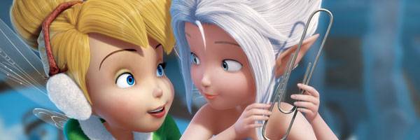
Art Director Fred Warter and Lighting Compositing Lead Nickie Huai created the special wing effect that plays an important role in the Walt Disney Studios new CG-animated feature film, Secret of the Wings. The fourth installment in the Disney Fairies series, Secret of the Wings is an exciting winter adventure that takes Tinker Bell on an epic journey and reveals a secret that changes her life forever. The film also introduces a sparkling new winter fairy by the name of Periwinkle.
At the animated film’s recent press day, I sat down with Warter and Huai to learn about their creative process and how they collaborated to extend the viewing experience and take audiences deeper into the magical world of Disney Fairies. They talked about their extensive research to find the right iridescent lighting quality for the wings, how Executive Producer John Lasseter challenged them to look to nature as their inspiration, what they did to give the wings a three-dimensional quality, how they looked for the right palettes that could be appealing or threatening for both a warm season and a forbidden winter world, and why falling snow was their biggest challenge in a very effects heavy movie.
Fred Warter: We’re going to talk a little bit about our creative collaborative process in creating the special wing effect. First, just a little bit of background on Nickie.
Nickie Huai: Hi. My name is Nickie Huai. I’m the Lighting Compositing Lead on Secret of the Wings. I have been with Disneytoon Studios for two years. Before that, I’d been doing lighting and compositing for ten years working on computer effects films and animated features like Avatar, Beowulf, Speed Racer, Horton Hears a Who and the Ice Age movies. For the past two years, at Disneytoon Studios, I was lucky enough to work with Fred on two shows and Secret of the Wings is the latest.
Warter: I’ve been working in animation close to 30 years. I started on 2D movies. I worked for Disney on a Goofy movie, The Hunchback of Notre Dame and Home on the Range. And then, I transitioned into CG movies. The first CG movie I worked on was Pixar’s A Bug’s Life. I was the art director on the first Tinkerbell and then on the third Tinkerbell, Tinkerbell and the Great Fairy Rescue, and the TV special that came out last year, Pixie Hollow Games. We’re going to talk a little about our process. The wings were an interesting challenge in that the wings had to visually represent the emotional connection between the two sisters. At the beginning of our process, after we have a script, we start with storyboards. (He shows us an image from the film on screen.) This was a shot in the movie when Tinkerbell first feels the presence of her sister being visualized in the Winter border, and this was storyboarded by an artist named John Howley. This is our first visualization of what the possibility of the wings could be.

From here, Peggy (director Peggy Holmes) choreographed some live action reference for the animators by acting out the scene. (He shows us a short video of Holmes rotating through the frame as the character.) She wanted a rotating camera along with the character rotating so we had to block out what the timing of that would be. That was just a very rough reference. This was our first visualizing of the effect and what it could look like. In our mythology, the fairies all have individual wings [that are unique] to that fairy like a fingerprint. And so, our idea was that since Tinker Bell and Peri were sisters, the wings should be identical. We thought that the veins of the wings should be highlighted in this effect and show that when they’re together that it’s very clear the wings are identical.
We produced the shot over a long period of time. (He shows us another image of the wings.) It got to the point where we did this shot as a proof of concept to show to John Lasseter. He thought it was nice. He thought it was promising, but he challenged us to go farther and to really push ourselves to try to come up with something really special, something we’d never really seen before, something really interesting. He couldn’t tell us what that was but he just challenged us. My first instinct was to add color. (He shows us more images with more color added.) These are some studies, some paintings of some color possibilities.

Is this maybe going to take us to the next level? Peggy, the director, liked these but she felt like “Can we go farther?” She reminded us of John Lasseter’s mantra of “always look to nature for your inspiration.” John was the one who came up with the idea that the fairies help bring the seasons to the world. We looked for some inspiration in nature. We looked at insects. (He shows us images of a green iridescent beetle, a hummingbird and a peacock.) That was the first obvious [place], and we looked at other animals that have wings. We looked at hummingbirds and peacocks. Then I started to think about what are other things in nature that have an iridescent, interesting lighting quality. We looked at opals and jewels and images of oil and water. We finally landed on abalone shell. We liked the quality of where it could look plain white, but then you turn it and hold it up to sunlight, and you start getting interesting light play.
From here, we created some visuals to try and capture that iridescent quality. We showed this to John Lasseter and he signed off on this as a proof of concept. And then, of course, from here, now we have to make it real. We have to bring it to three dimensions and that’s where Nickie came in and brought her magic.

Huai: (laughs) A little pressure. We needed to figure out a way to translate Fred’s vista painting into the movie and make it produce-able and produce-able many times throughout the movie. The first approach was a straightforward texture approach mimicking the pattern and the color and projecting it out to the wings. But it was a mimic and it didn’t have the spirit of the wings. It’s not magical. It’s not reacting to the light. It just stuck out. We decided to go with a different approach that’s a more procedural way in the shading to have the wings react to lights and cameras.
Warter: This was promising but it felt like it was just like planes of glass. We needed a little bit more a sense of dimensionality so we could take it further.
Huai: There were missing details. I started painting a displacement map and started sculpting the wings so that it would have more three dimensionality to it and then it started looking better.

Warter: It started to come together.
Huai: We wanted to keep pushing. We added more sparkles and we quickly realized that…
Warter: It was a little too busy because we were still planning on overlaying the vein sparkle effect, so this just got a little bit over the top.
Huai: It was too much.
Warter: It was just too busy. Sometimes you have to go further to know that you’ve gone too far and you have to come back. It’s kind of a back and forth process.
Huai: We went back to the earlier approach and applied the shader onto the shot, the final animation in the camera. At that moment, everything came alive. It all came together and felt [right]. When I saw it, I thought “Oh my gosh!” I was like a little girl again. It was so pretty and magical.
Warter: It was like nothing we’d ever seen before. We knew we were on the right track.
Huai: We were on the right track and from there we just narrowed and pushed to dial it in.

Warter: It was a matter of trying to find the palette because we had to play these wings over a number of different scenes and times of day. We found that if we went too orange, the wings tended to look gray. They just looked muddy. We had to figure out the right palette that would work for the whole movie. We narrowed it to more of a blue-violet range with just a little hint of the yellow-orange here and there.
Huai: We also dropped the environment lights so the wings popped more and it was more sparkly. (She shows us the final shot.) This is the final shader that went into the movie and this is the final shot.
Question: How long did the process of developing and designing the wings take?
Warter: The total process of making this movie was approximately four years. But, to get it to the point where we were ready to show it to John Lasseter obviously took a lot of stages. The animator had to animate the character and the wings and then had to go through lighting and then we had to have the falling snow effects and then apply our concept of the wing sparkle effect. So that may have taken as much as a couple of years to get to that point. We had very limited time with John Lasseter. When we finally got it in front of him, he was like “Go further. Raise the bar.” It was like “Oh my gosh! Really? How can we make this better?”
Huai: Right. And what is ‘magical’?

Warter: Yes, it’s this undefinable thing. It’s just so great that he pushed us to go further and challenged us to dig down and find this effect. It’s like that with everything – the storytelling, art direction and color and lighting.
When you’re working over a period of time that involves several years, do advances in technology influence the choices and possible changes you make in the design?
Huai: Oh yes, that’s part of the challenge of how to pick and choose what. You can always go with the newest technology, but you have to maintain the look, especially with the franchise. We’ve already made three movies, shorts and TV specials so we want to improve the look, but it cannot be very different or different enough that people can’t recognize.
Warter: There has to be a continuity of look, for sure, and the technology will sometimes push that.
Huai: In this movie, technology is really important because of all of the effects.

Warter: It’s very challenging and a very effects heavy movie. There are a lot of effects that you didn’t anticipate would be difficult like the falling snow ended up being on a shot by shot basis. We had to choreograph the speed and the direction of the snow. You don’t want a snowflake coming across a character’s face at a critical emotional moment to distract you and pull you out of the movie. So, little things ended up being a challenge. I think Nicki mentioned there haven’t been many CG animated movies that have snow because it is so difficult.
Huai: We have so many shots that have snow in them.
Since there are two different seasons with different colors, does the lighting have to be completely different, almost like two different movies?
Warter: Yes, that’s a challenge too. Snow is white. How do you make it look appealing and attractive? We didn’t want the winter world to be completely threatening and the warm world to be wonderful. You had to pick palettes that were appealing for both worlds and then palettes that were threatening for both worlds. It was definitely a challenge to find that. I’m a big fan of going on research trips. I paint on my own time outdoors, so I made a point of going up to the mountains, our local mountains, when we have winter and observe what the color shadows are throughout the day on snow. There’s actually a lot of light and a lot of interesting situations in winter. But, winter is definitely a new challenge for the franchise. What’s hard with these movies is you create a technology and then we may never make another winter movie again. So you’re great at this technology. “Can’t we make a TV special or something? A Christmas special?” Winter was very challenging.
How was it merging the two seasons when the winter frost invades the warmer season?
Warter: That was definitely a challenge. We talked to a weather expert and he advised us about what the conditions would be if there was a freeze. He said it is basically a clear blue sky that’s absolutely crisp clear when a freeze happens. But I said “That’s counter to threatening. How do we make it threatening?” I would think we’d go gray and stormy and that instinct ended up not being right for the movie. That crisp blue was so right and that came from research and again John Lasseter pushing us to look to nature.